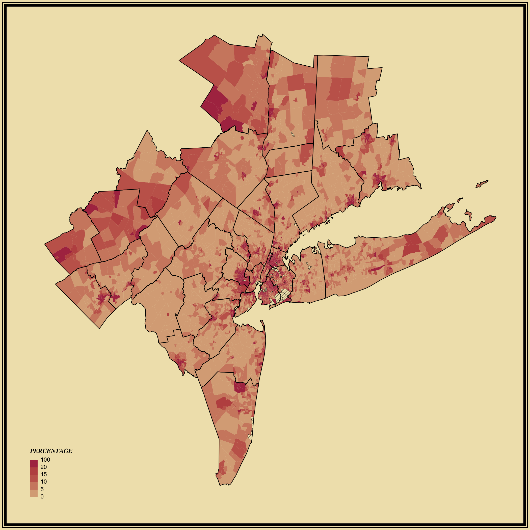
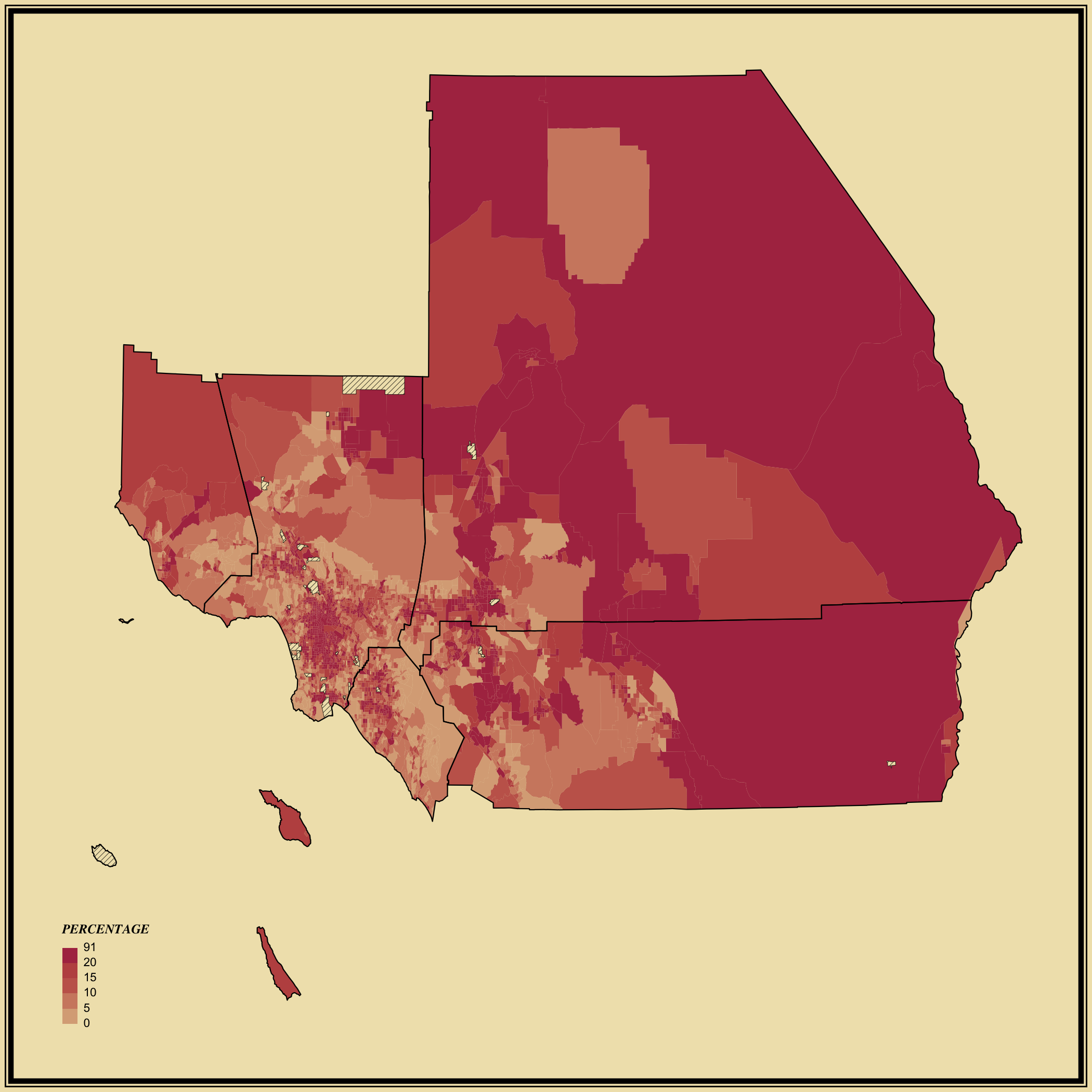
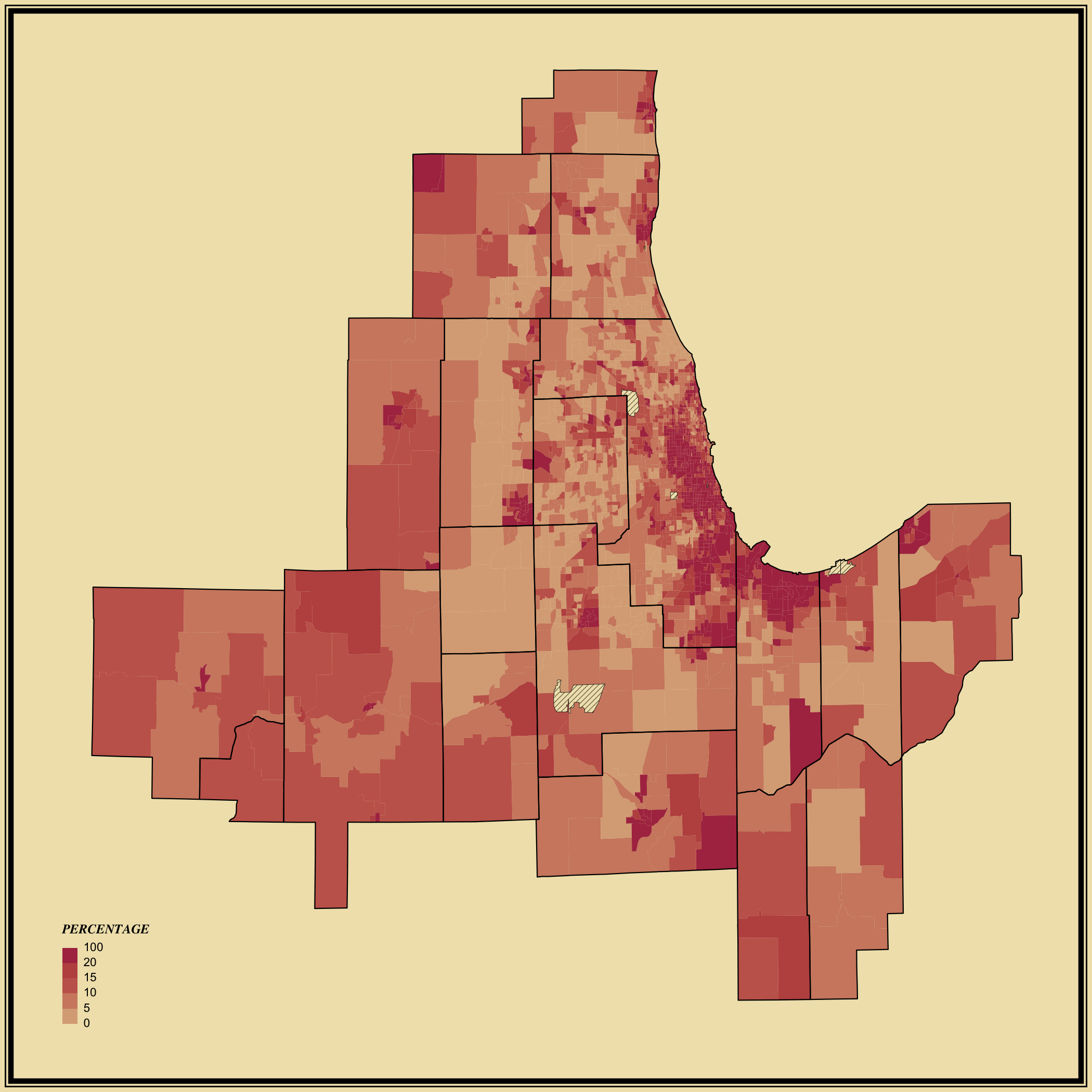
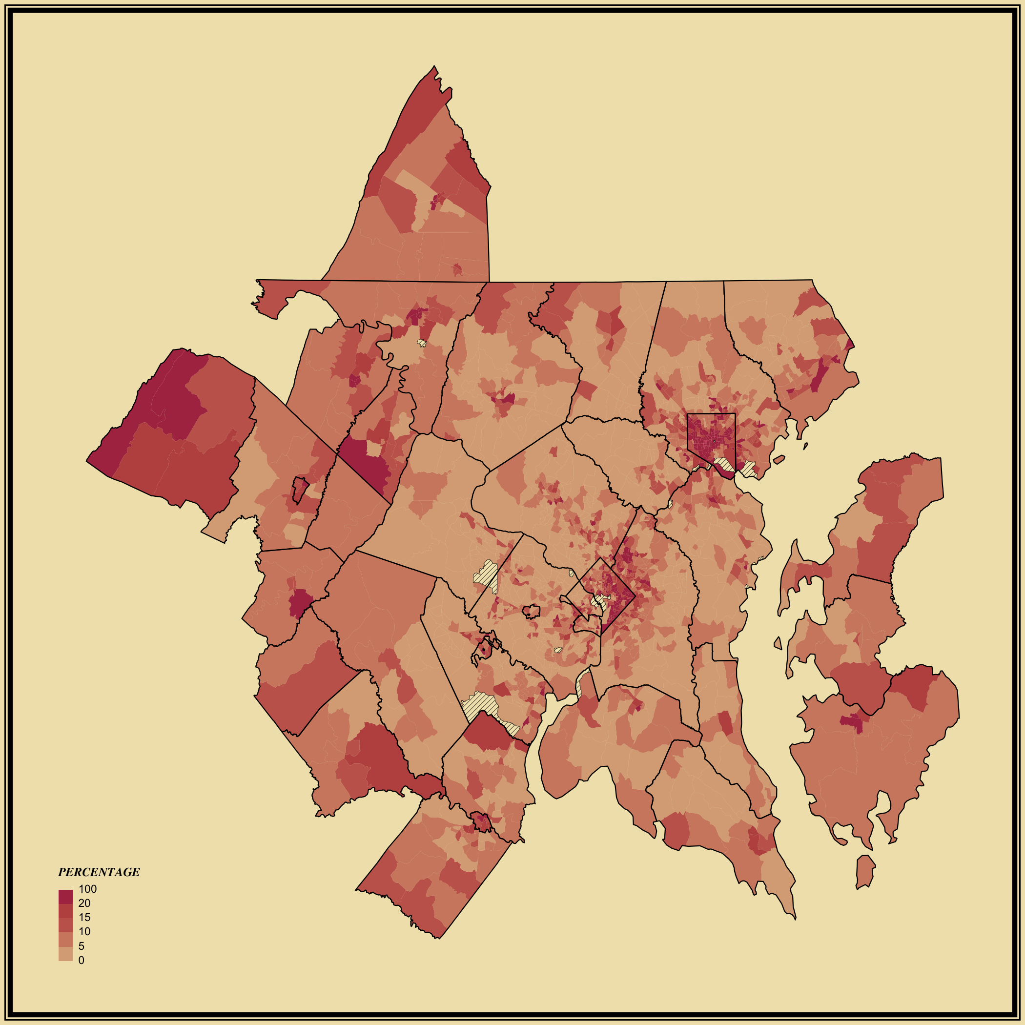
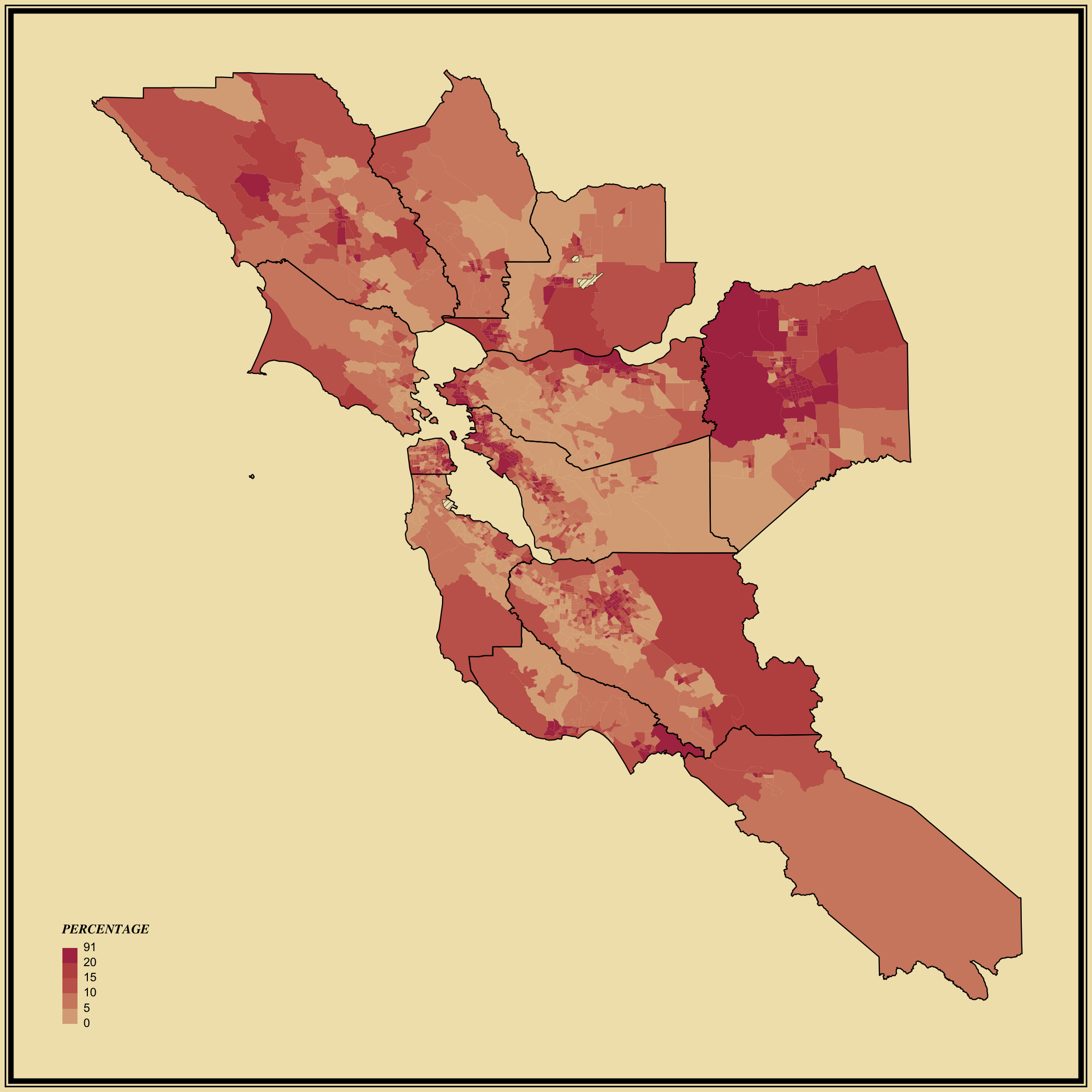
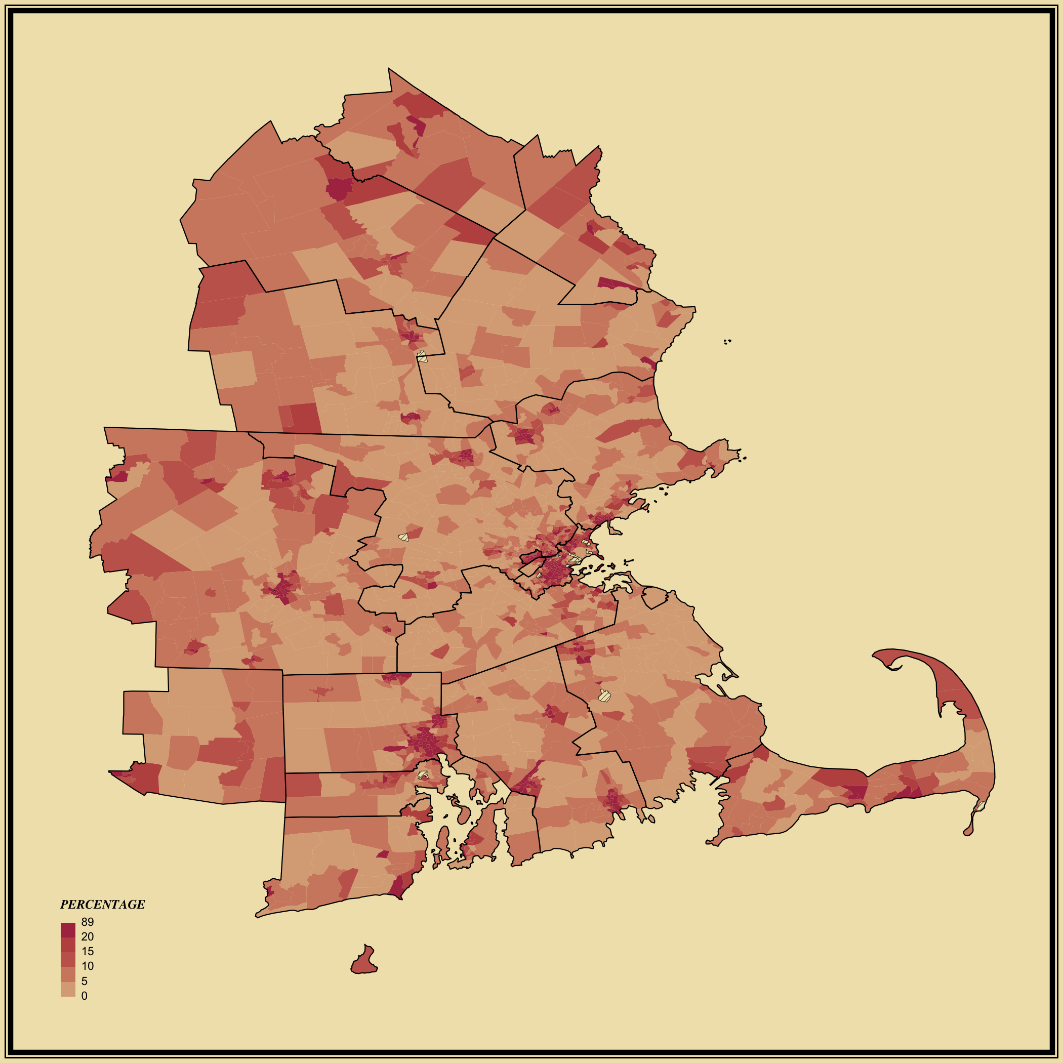
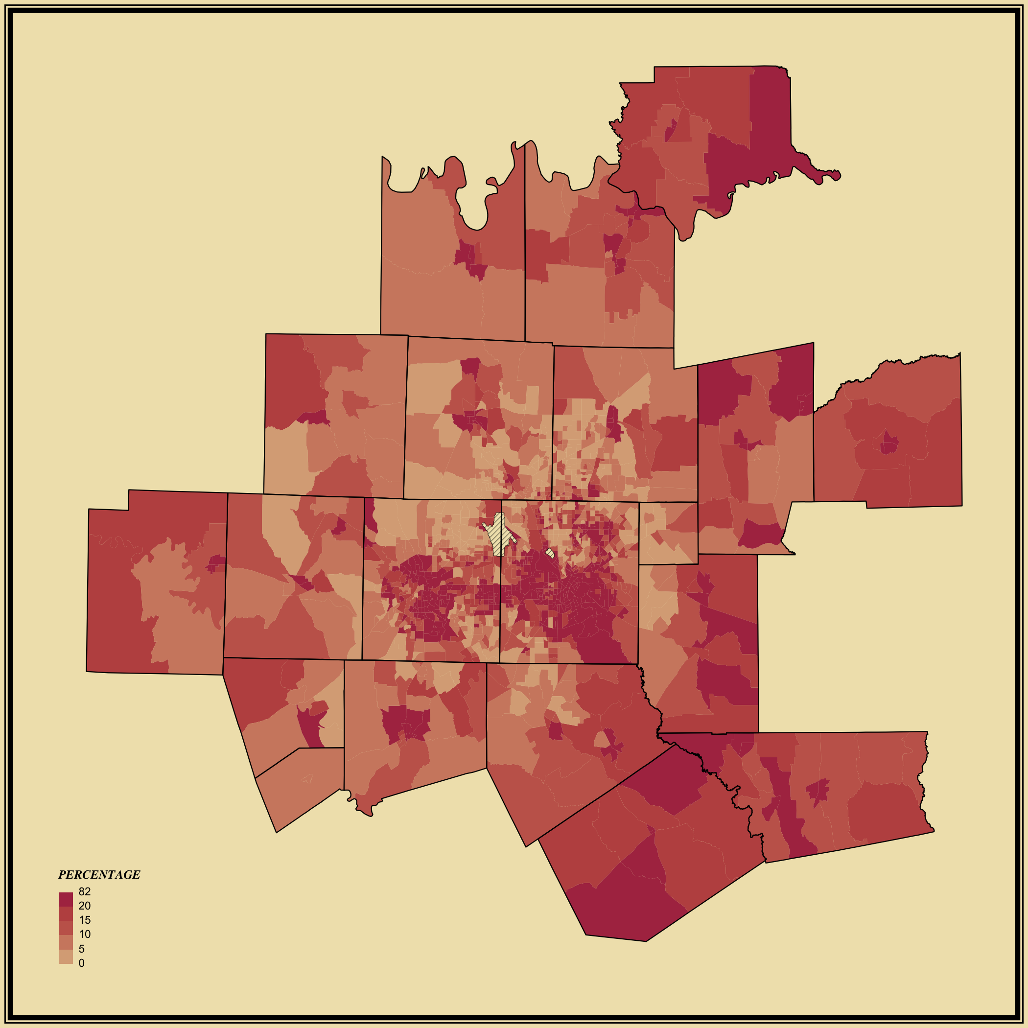
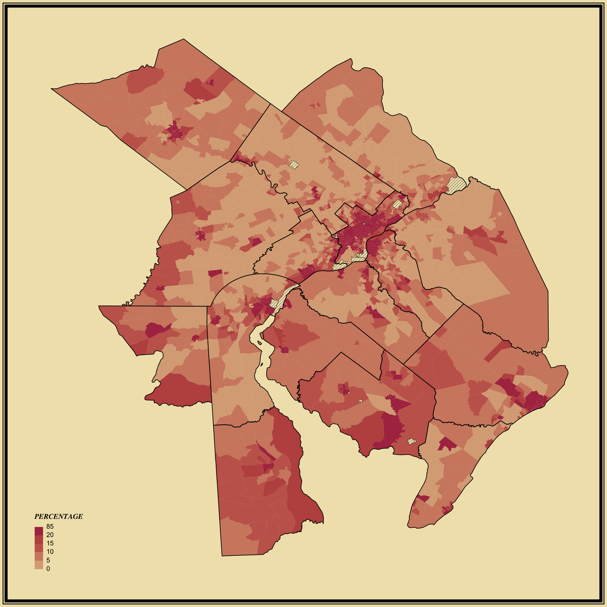
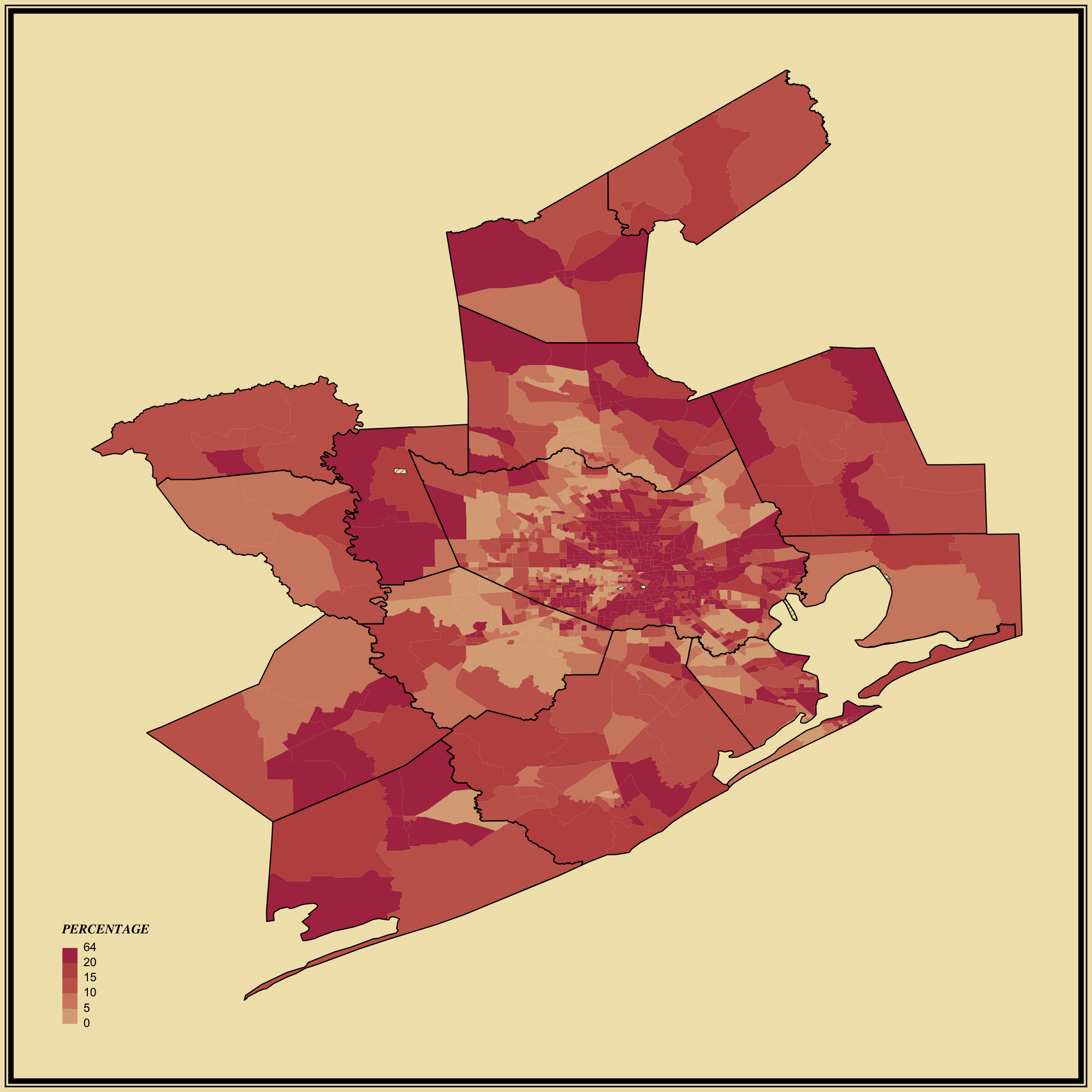
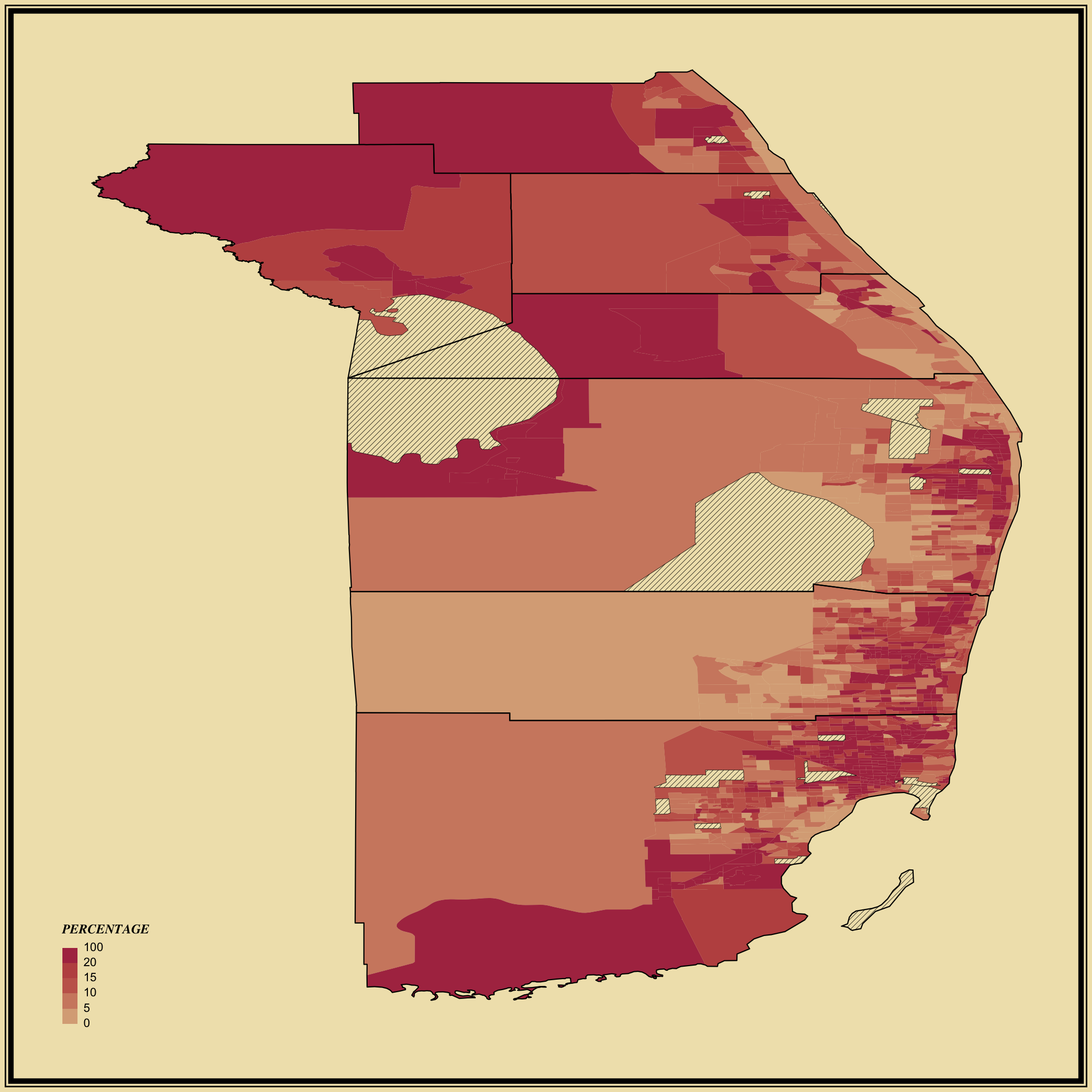
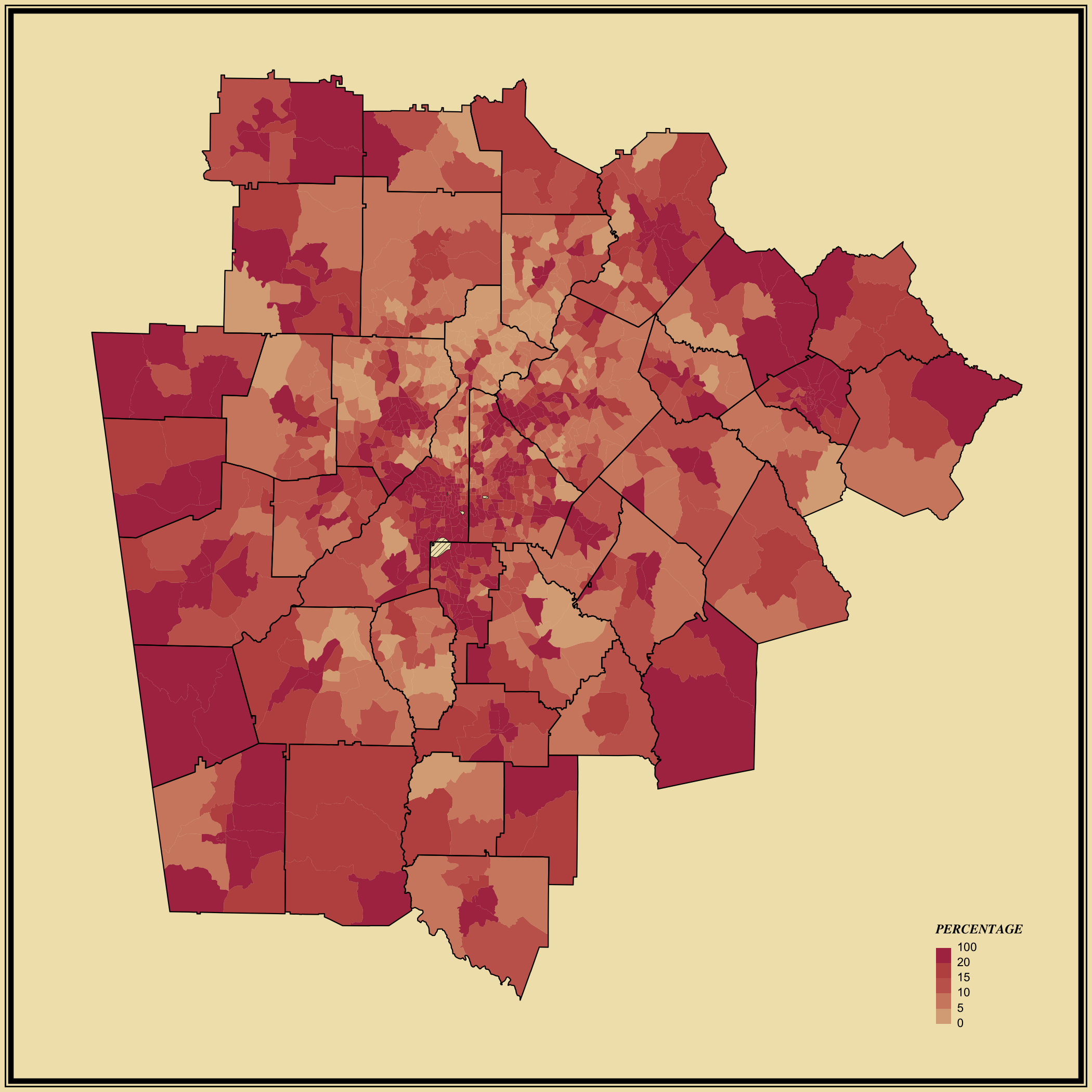
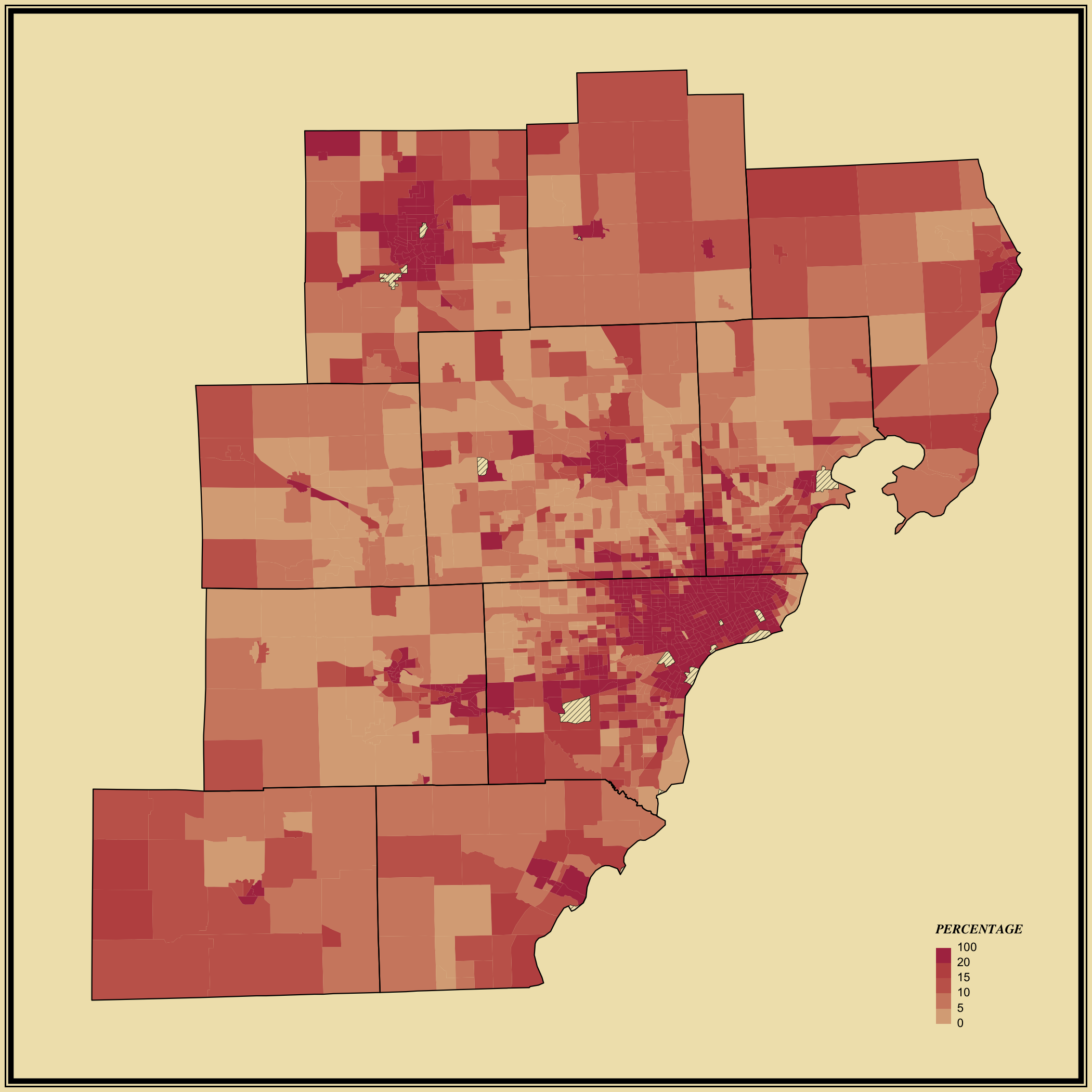
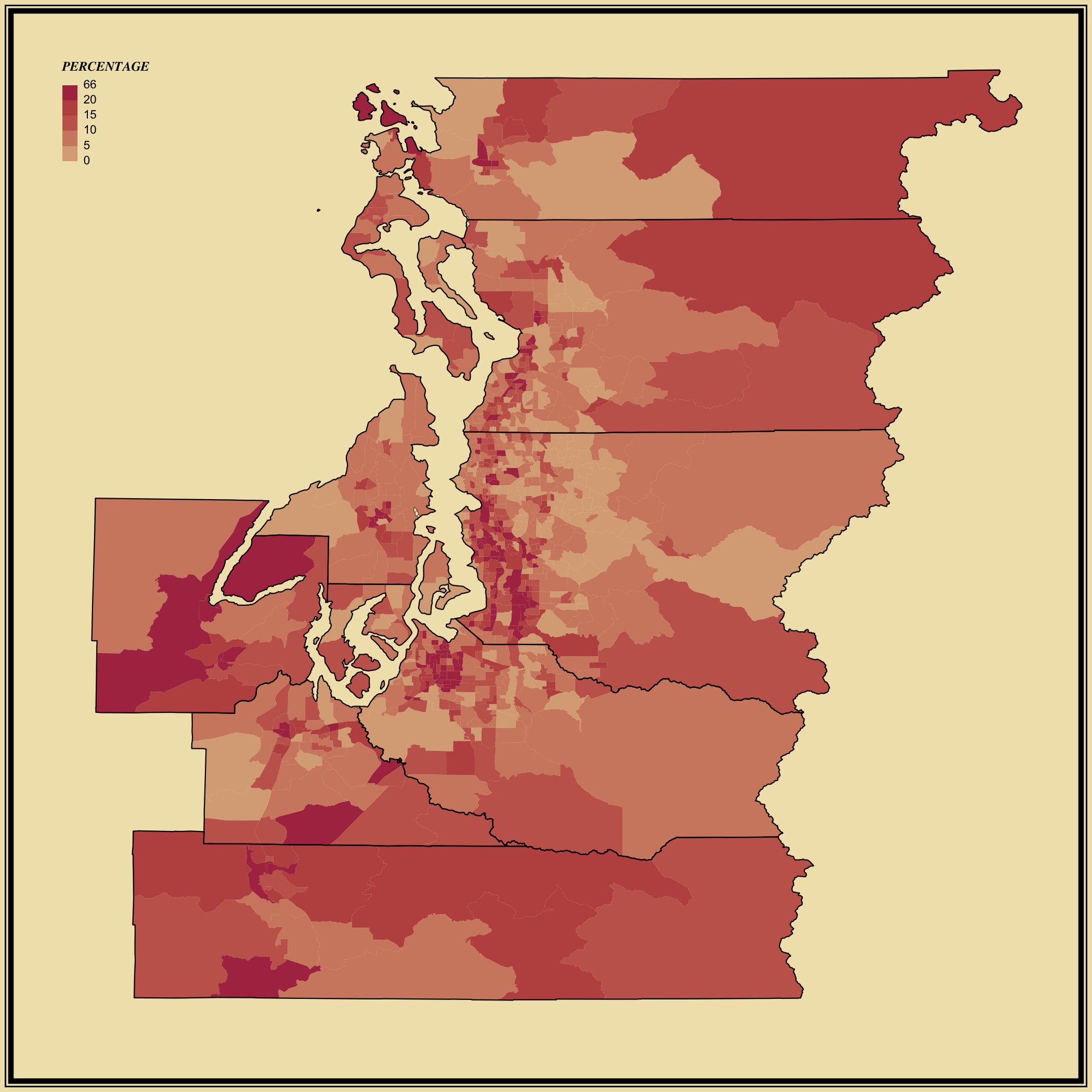
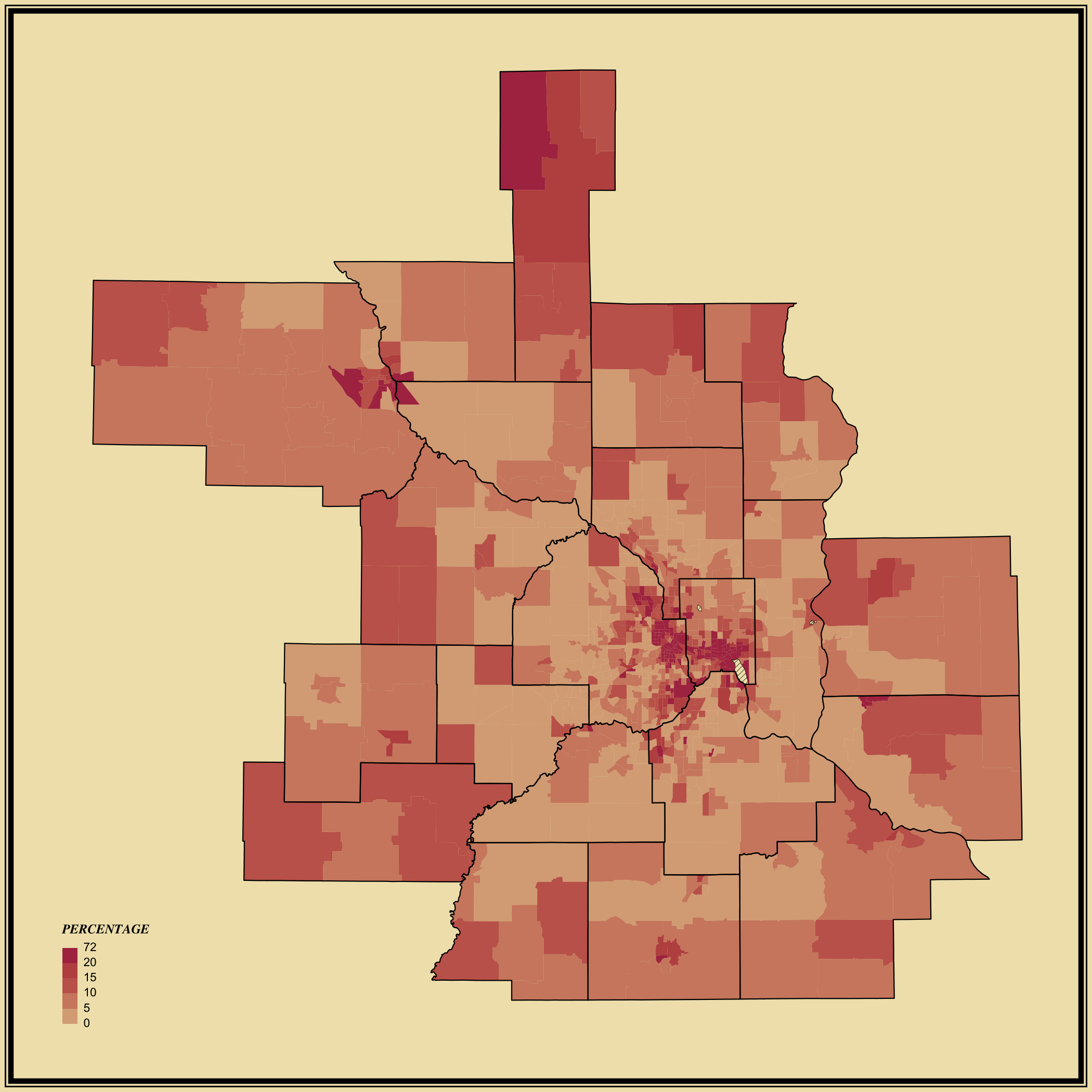
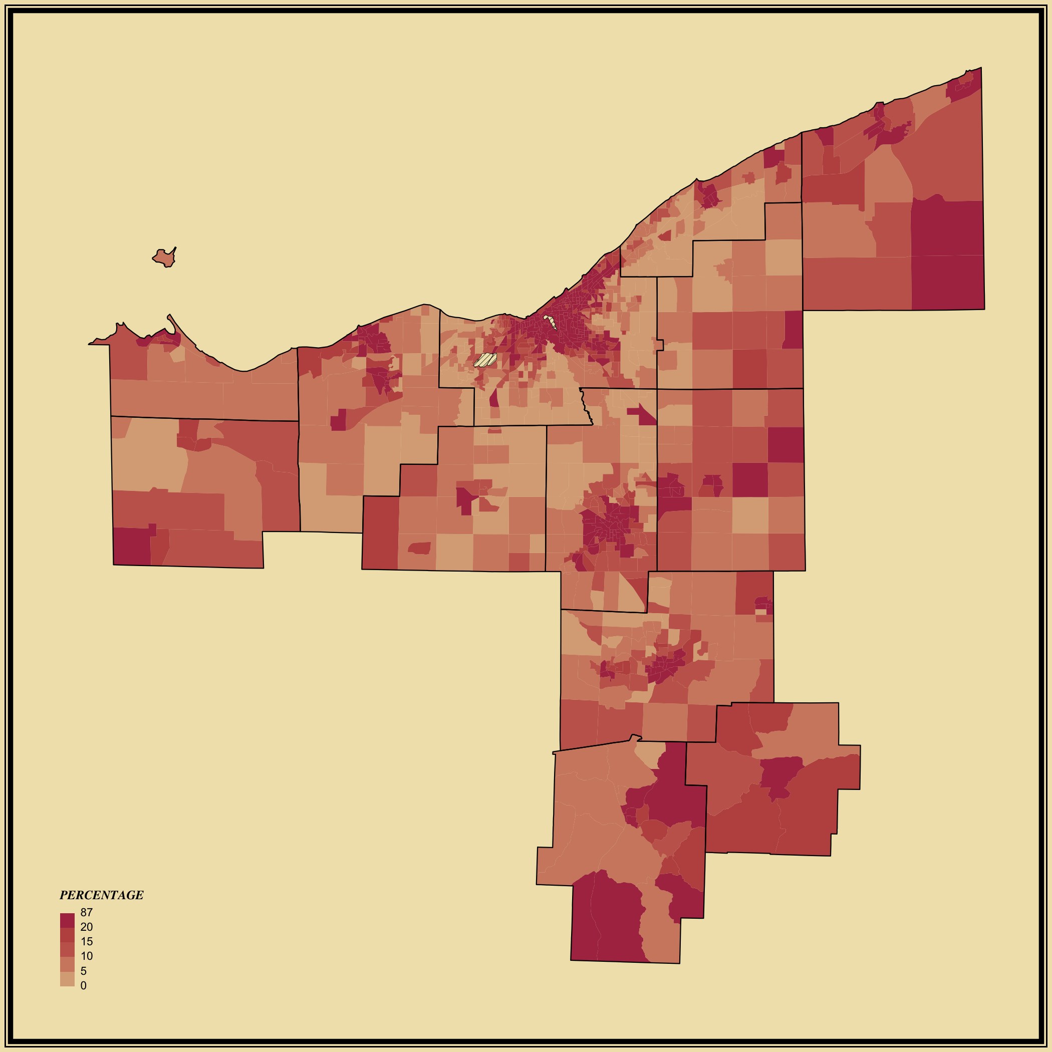
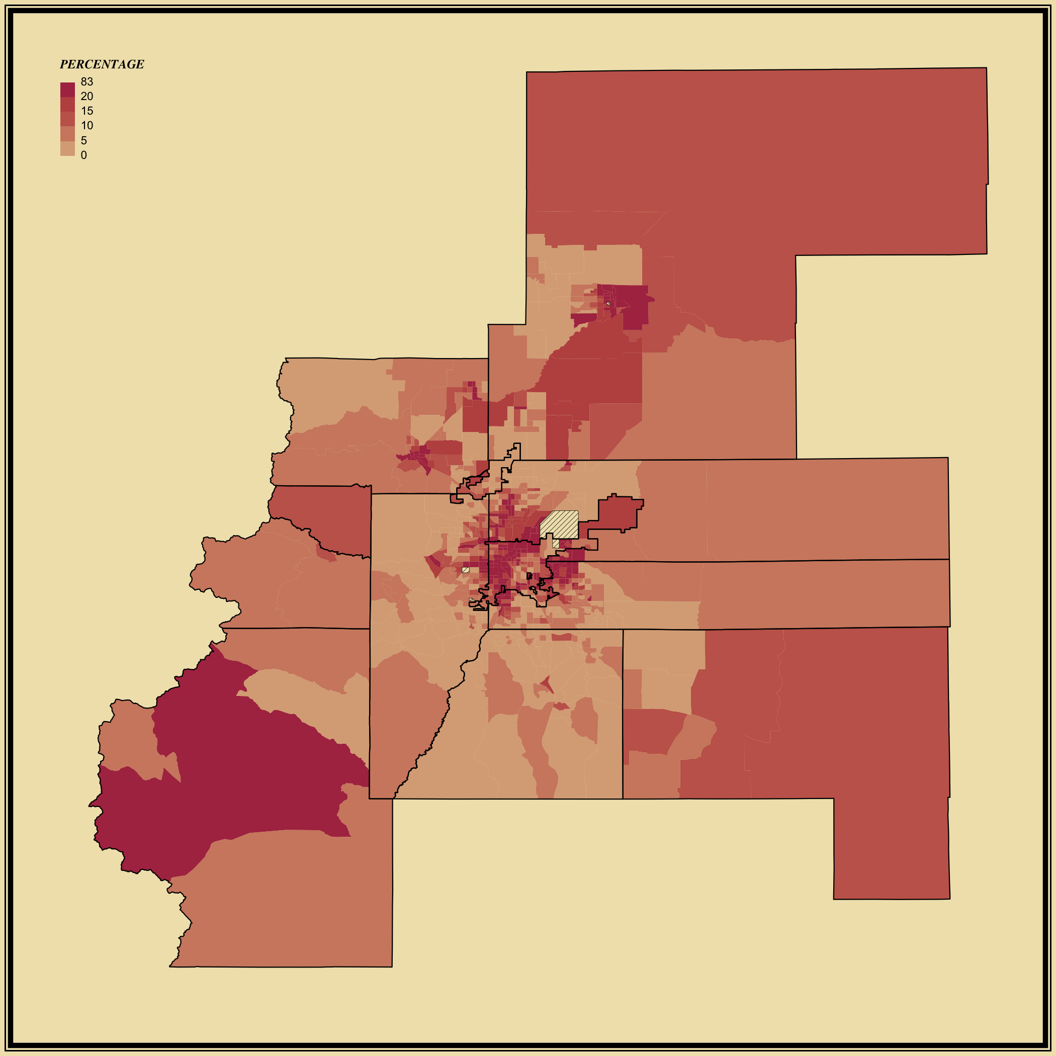
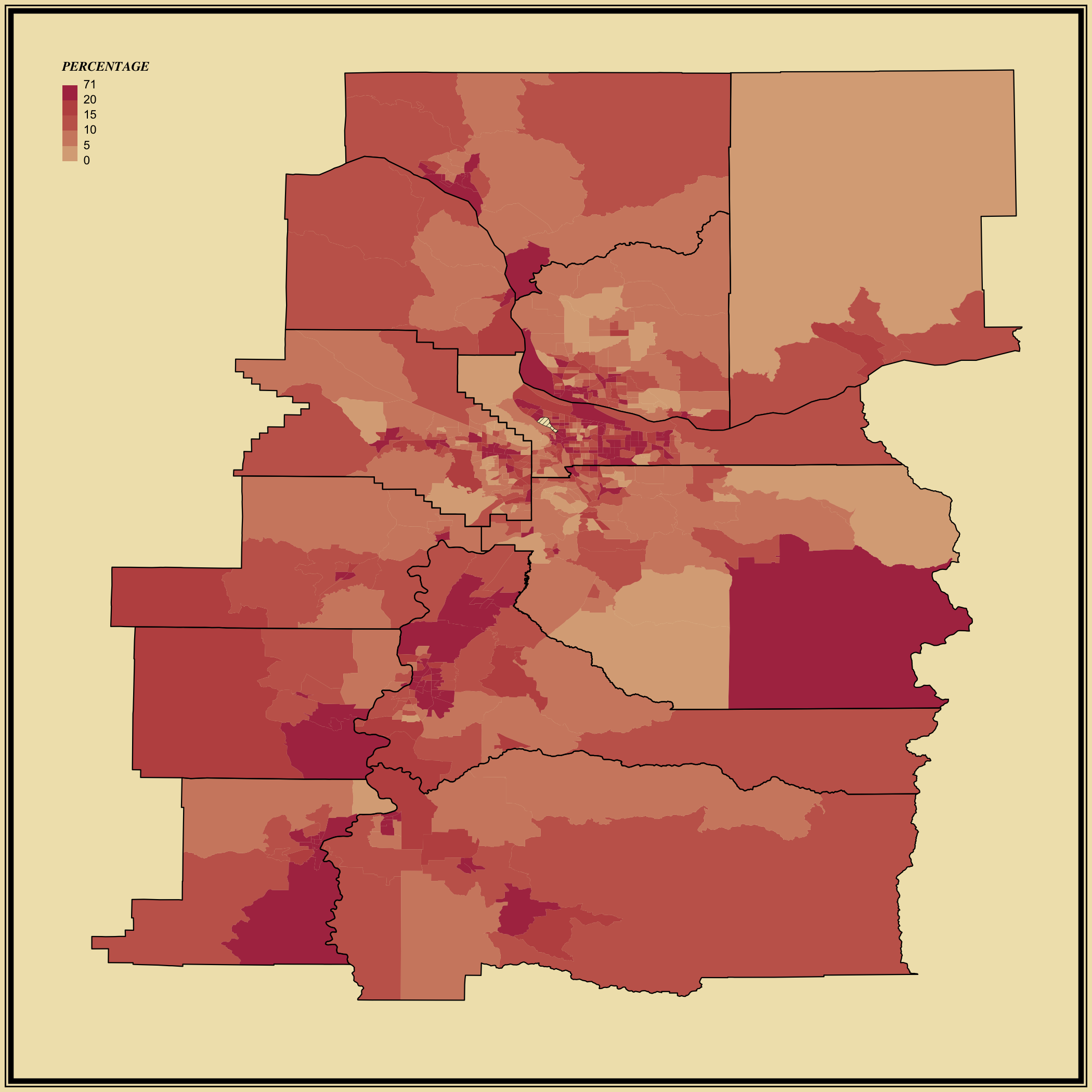
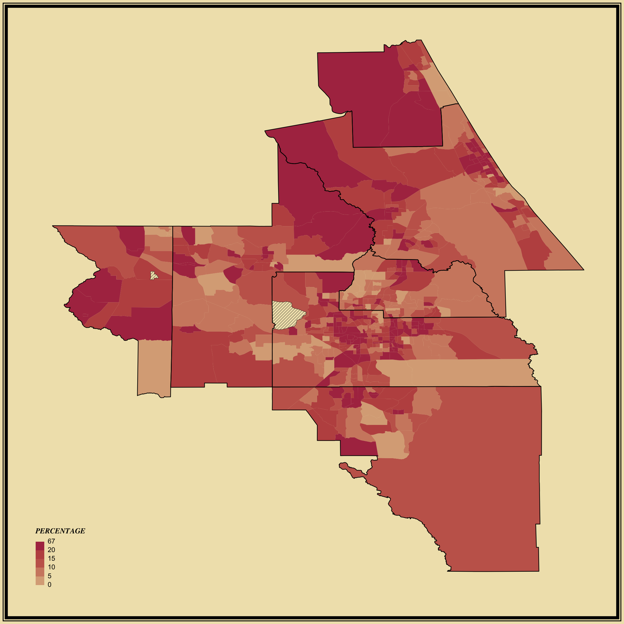
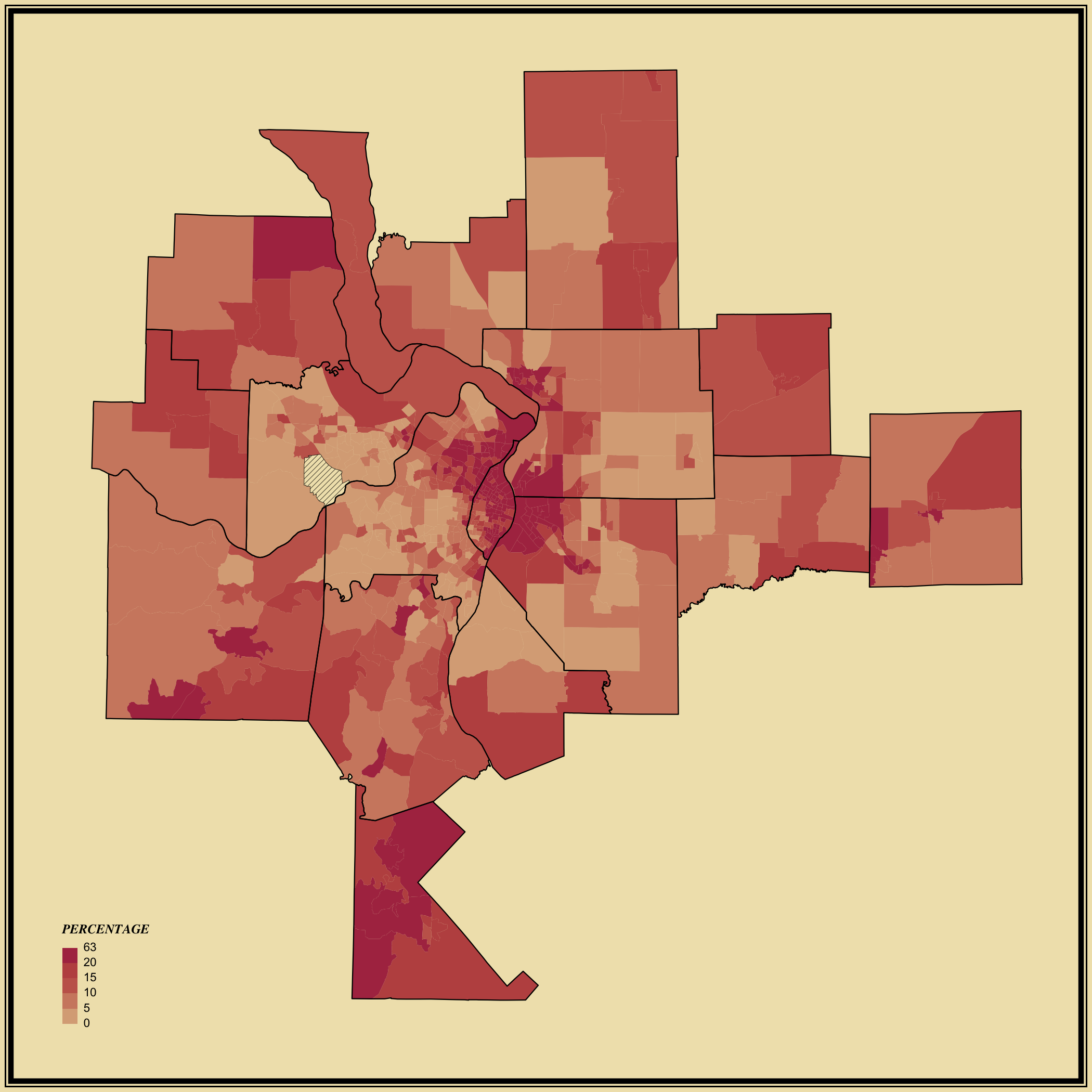
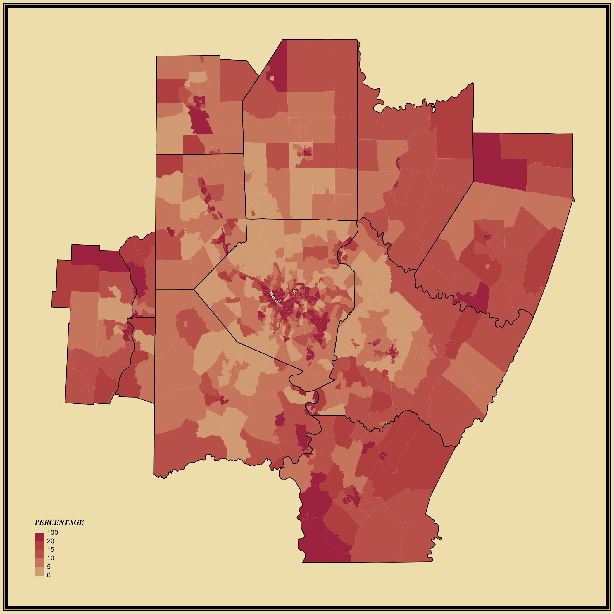
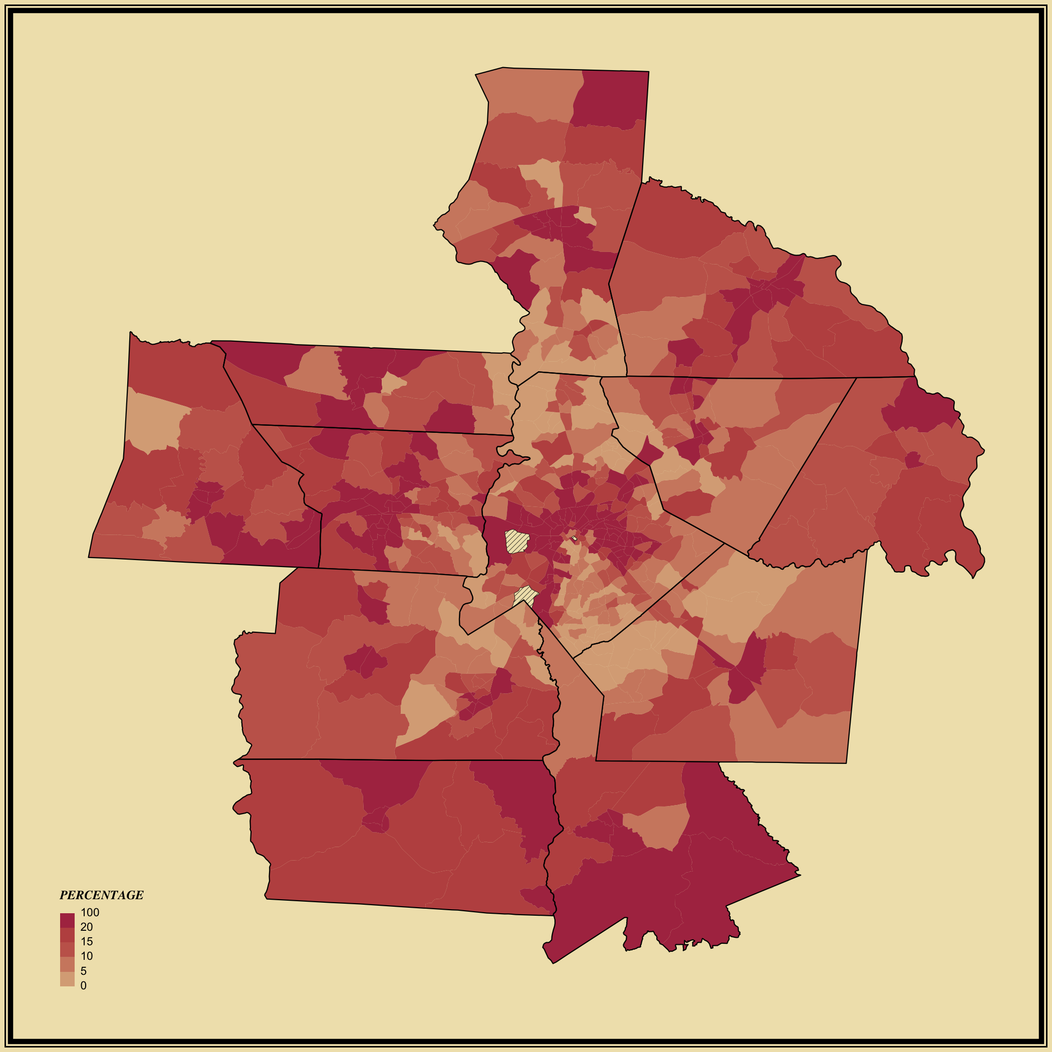
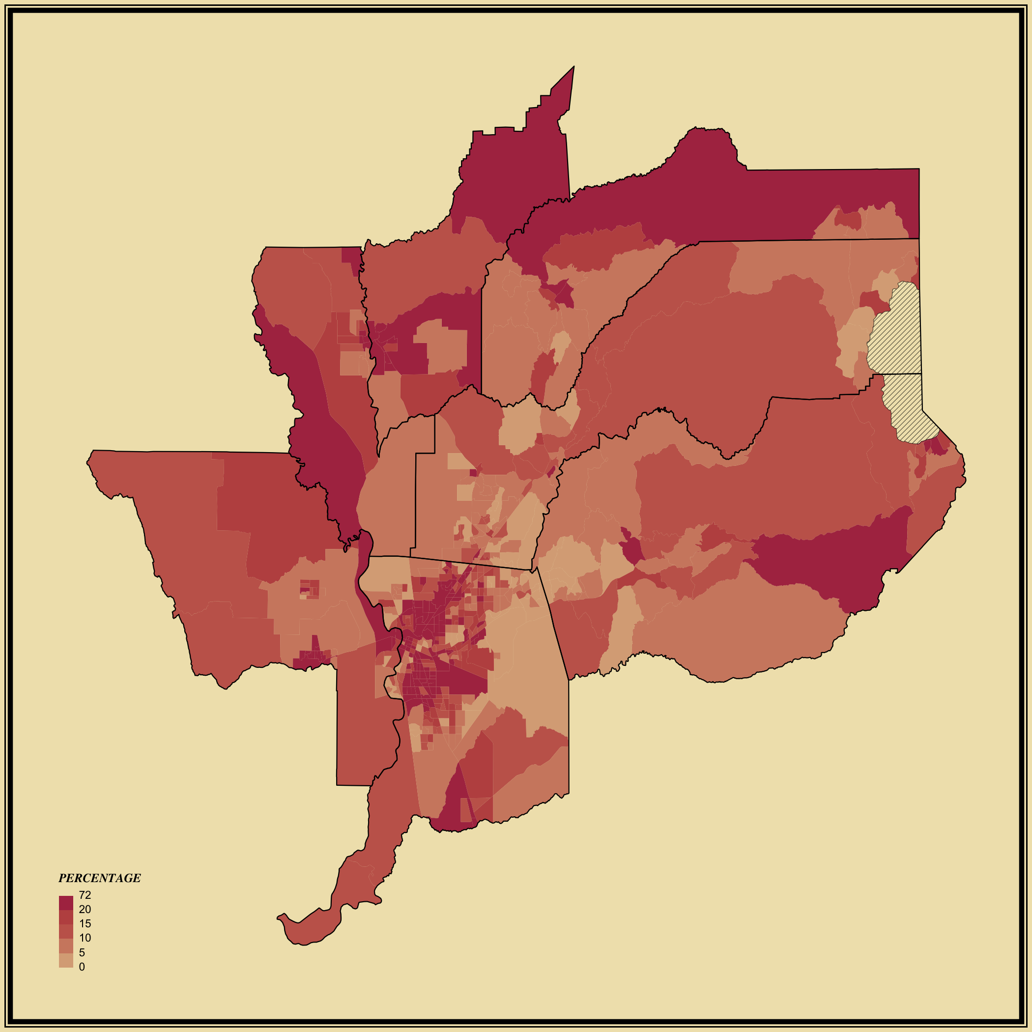
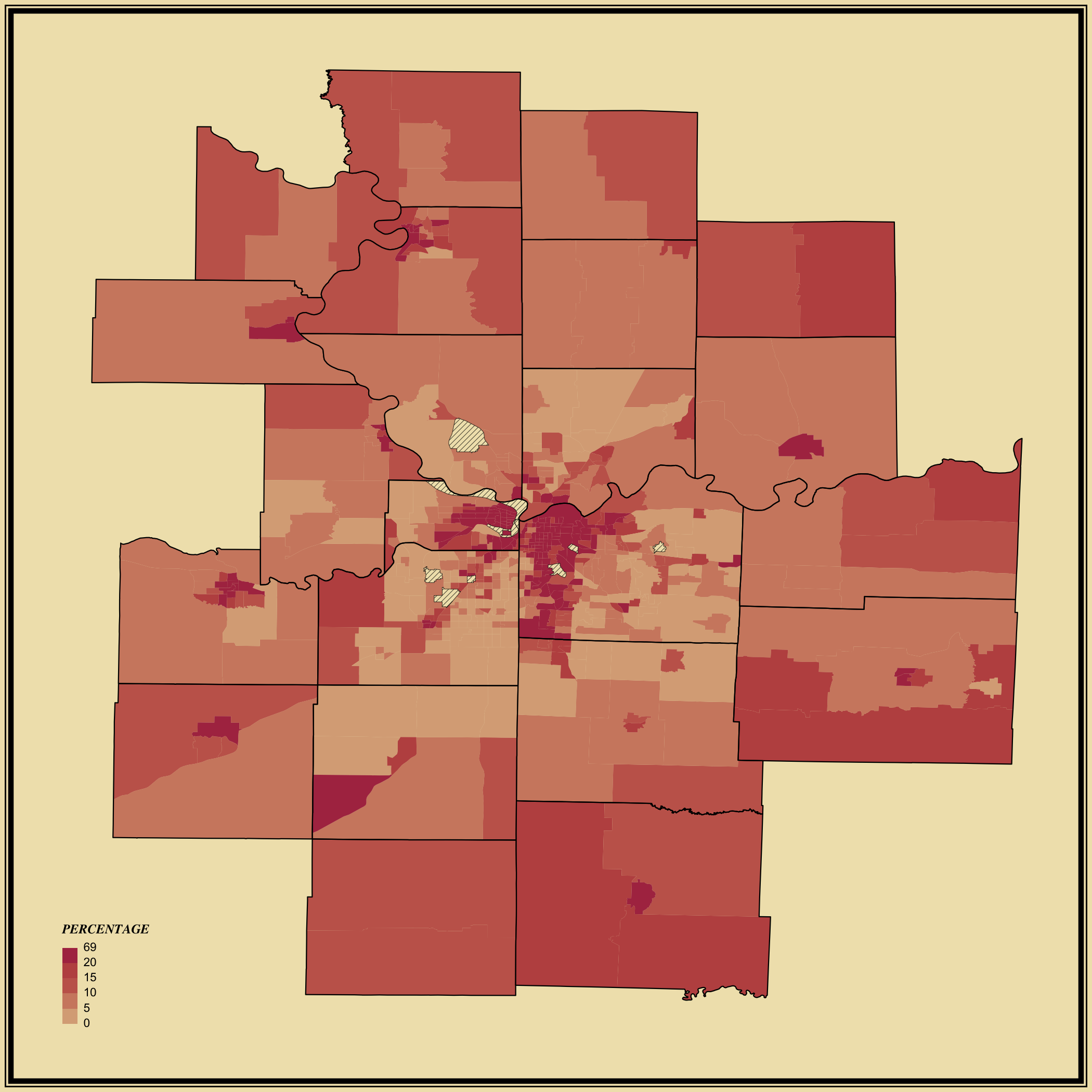
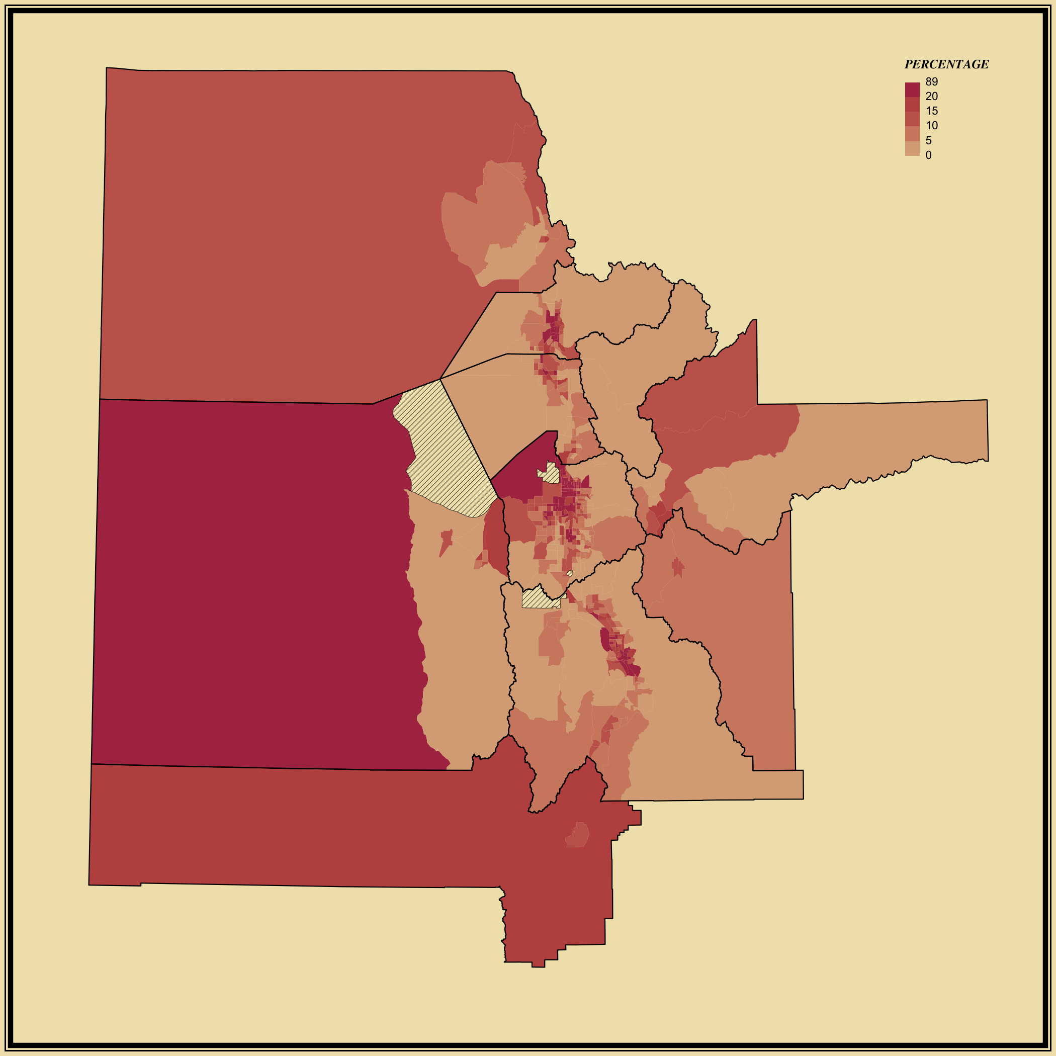
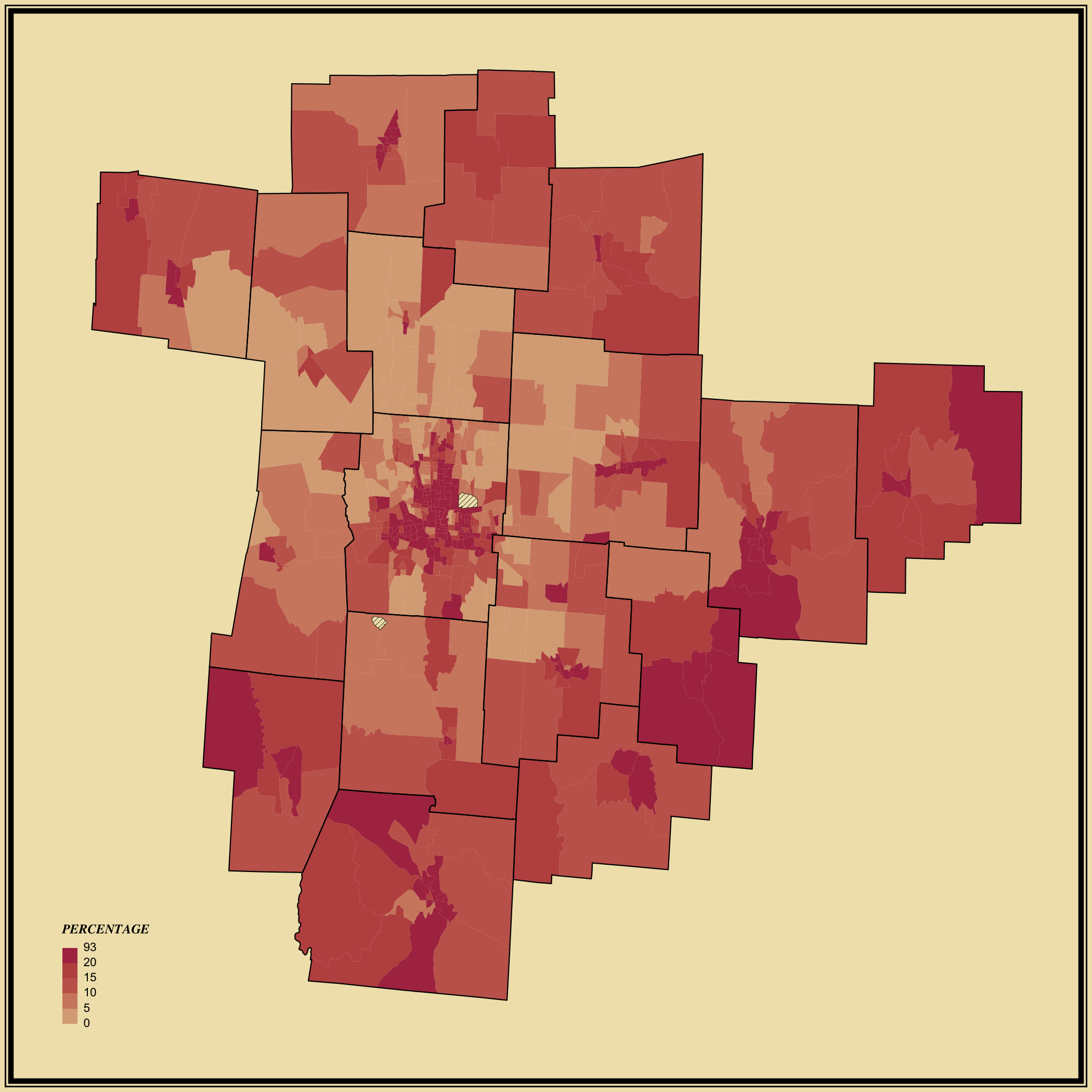
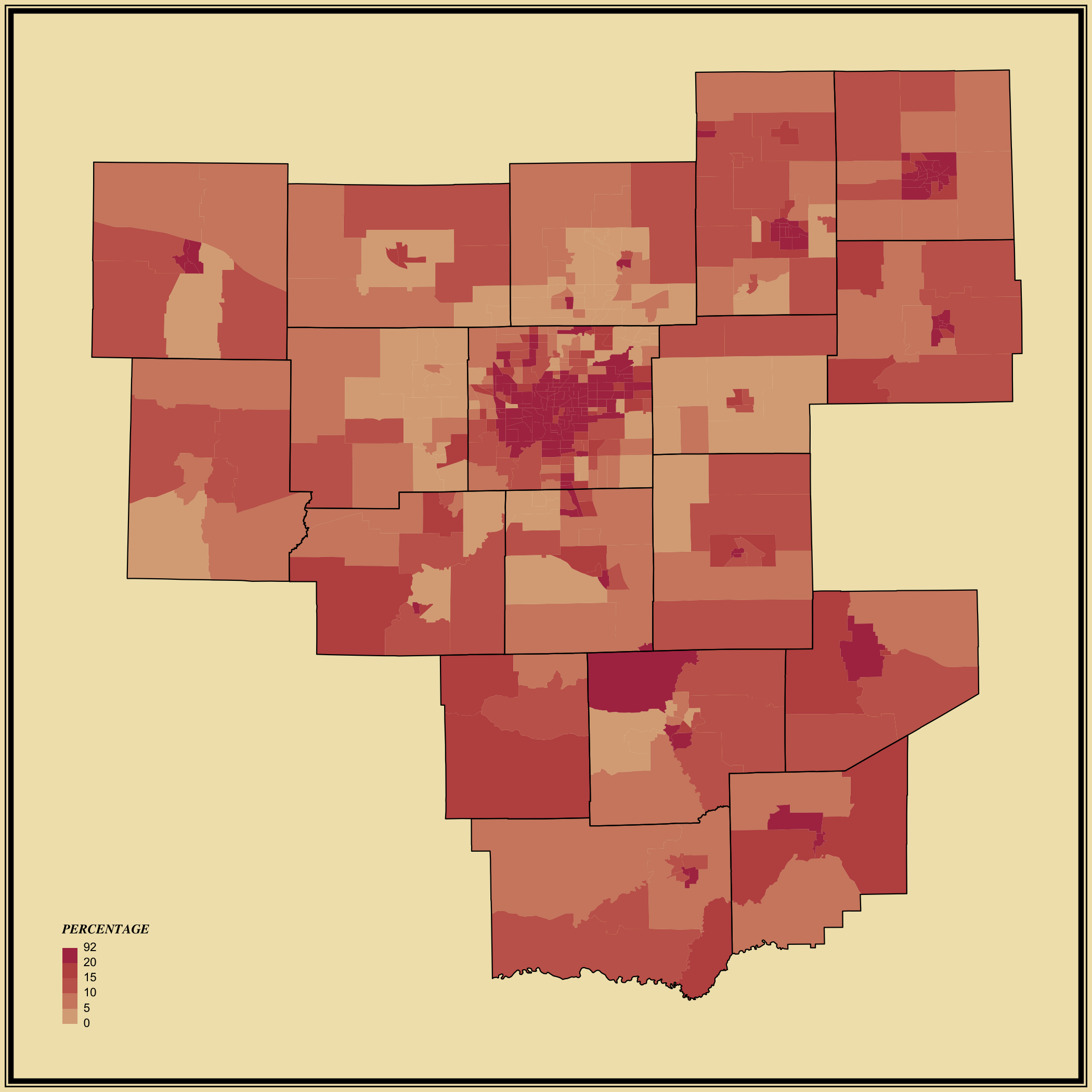
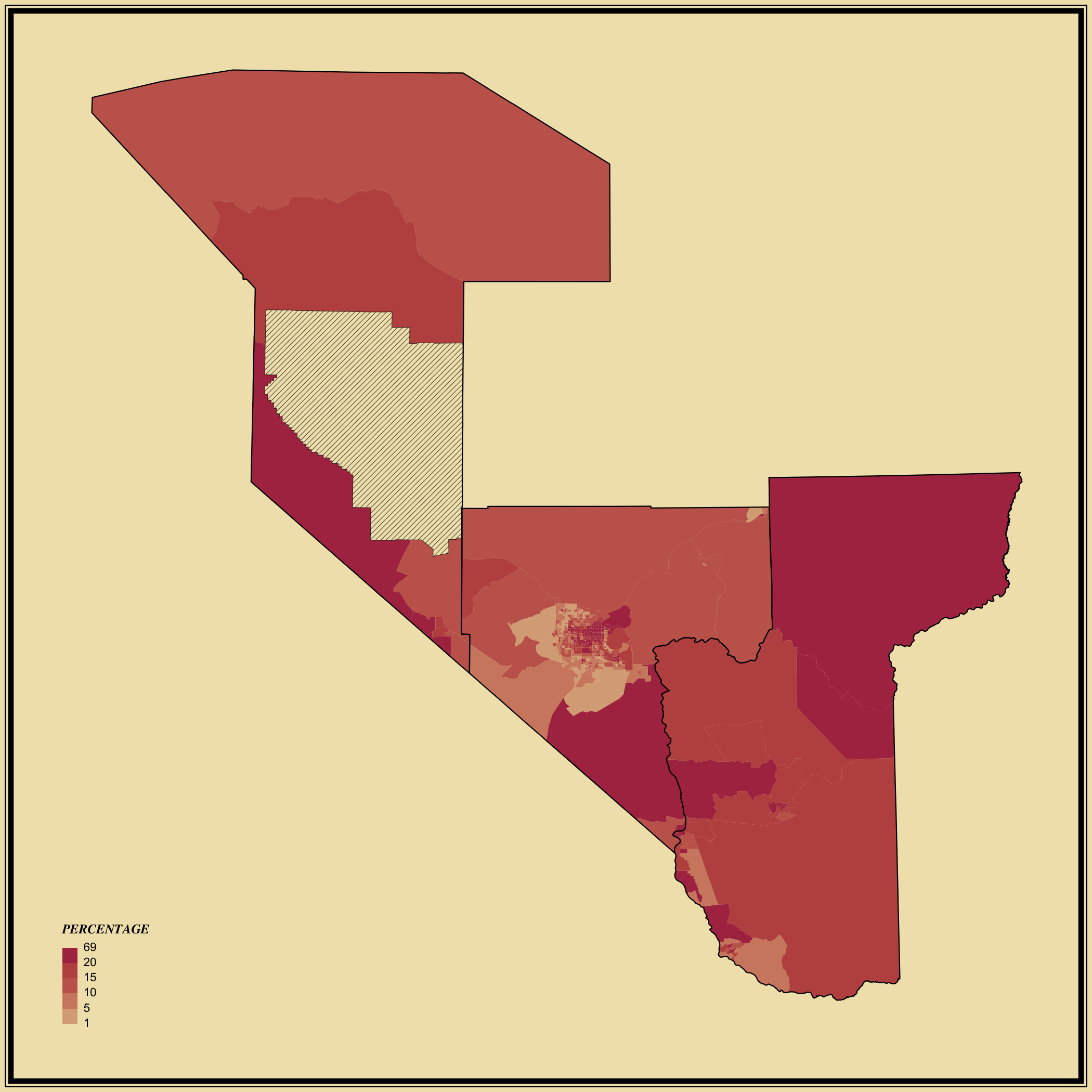
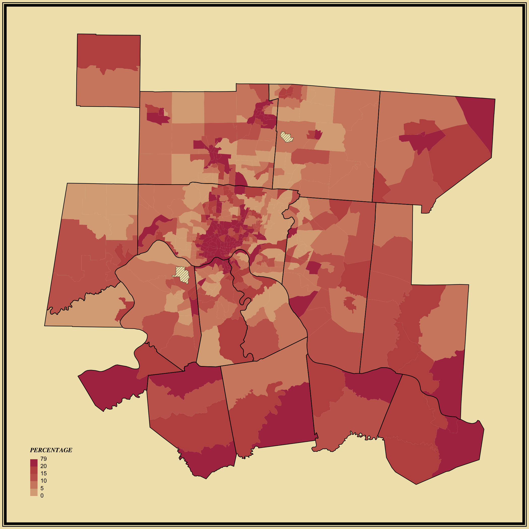
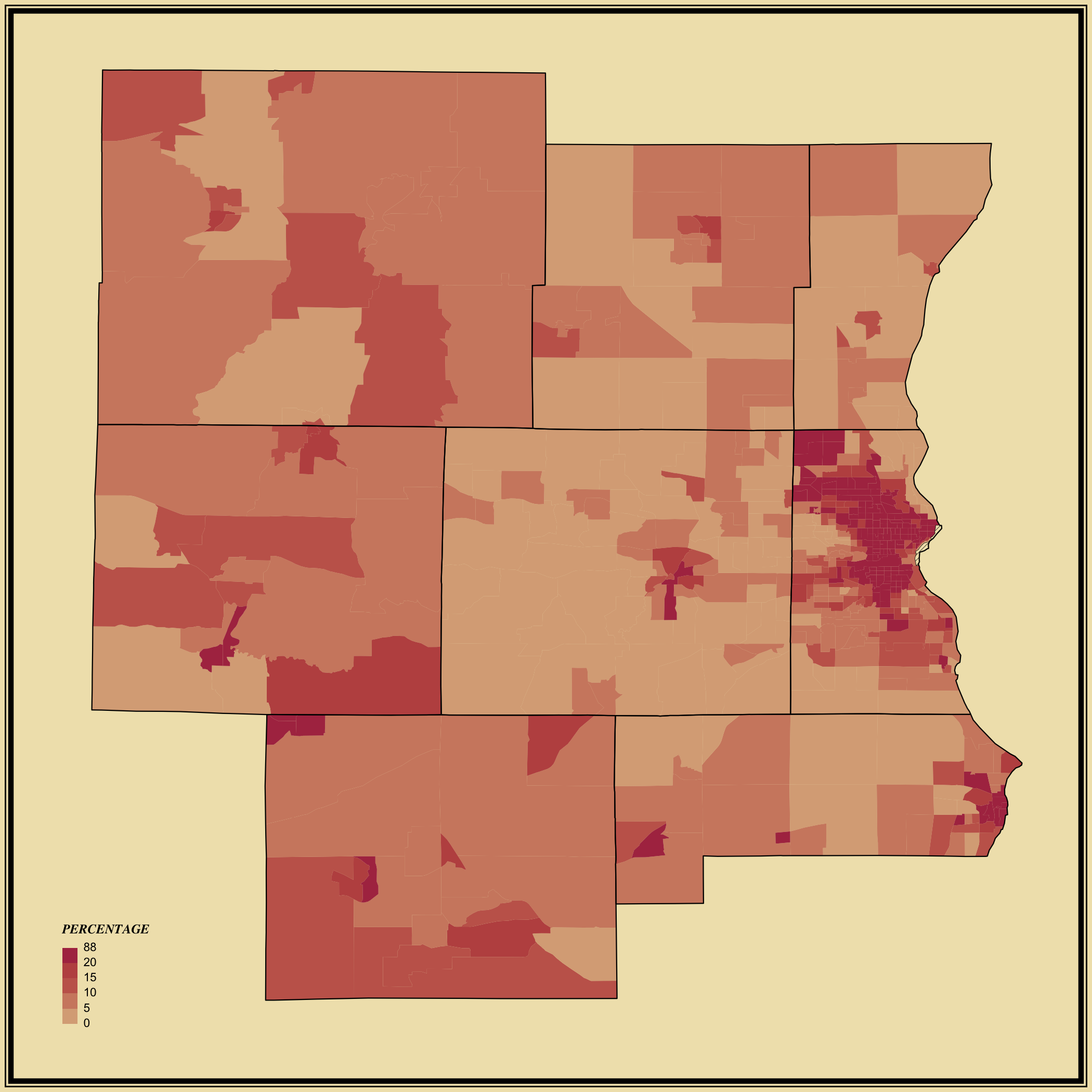
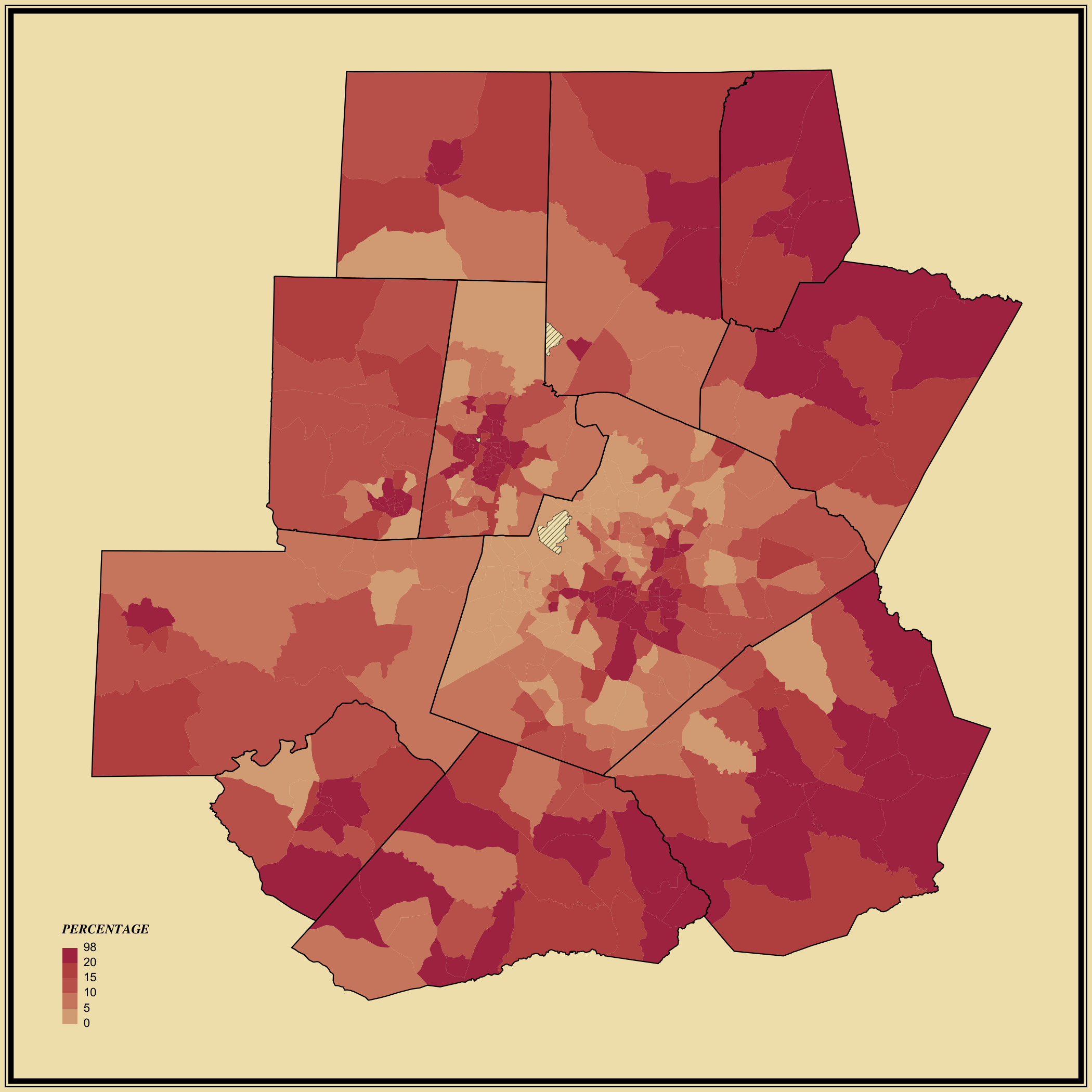
This set of choropleth maps shows poverty rate among the population the Census Bureau estimates poverty for, via the 5-year American Community Survey. Darker shades of red represent higher poverty rates and lighter shades of red represent lower values.
City centers tend to have higher rates of poverty, and suburban areas just outside the city tend to have lower rates. Venture out of this range, and you see higher rates again, as housing costs decrease.
