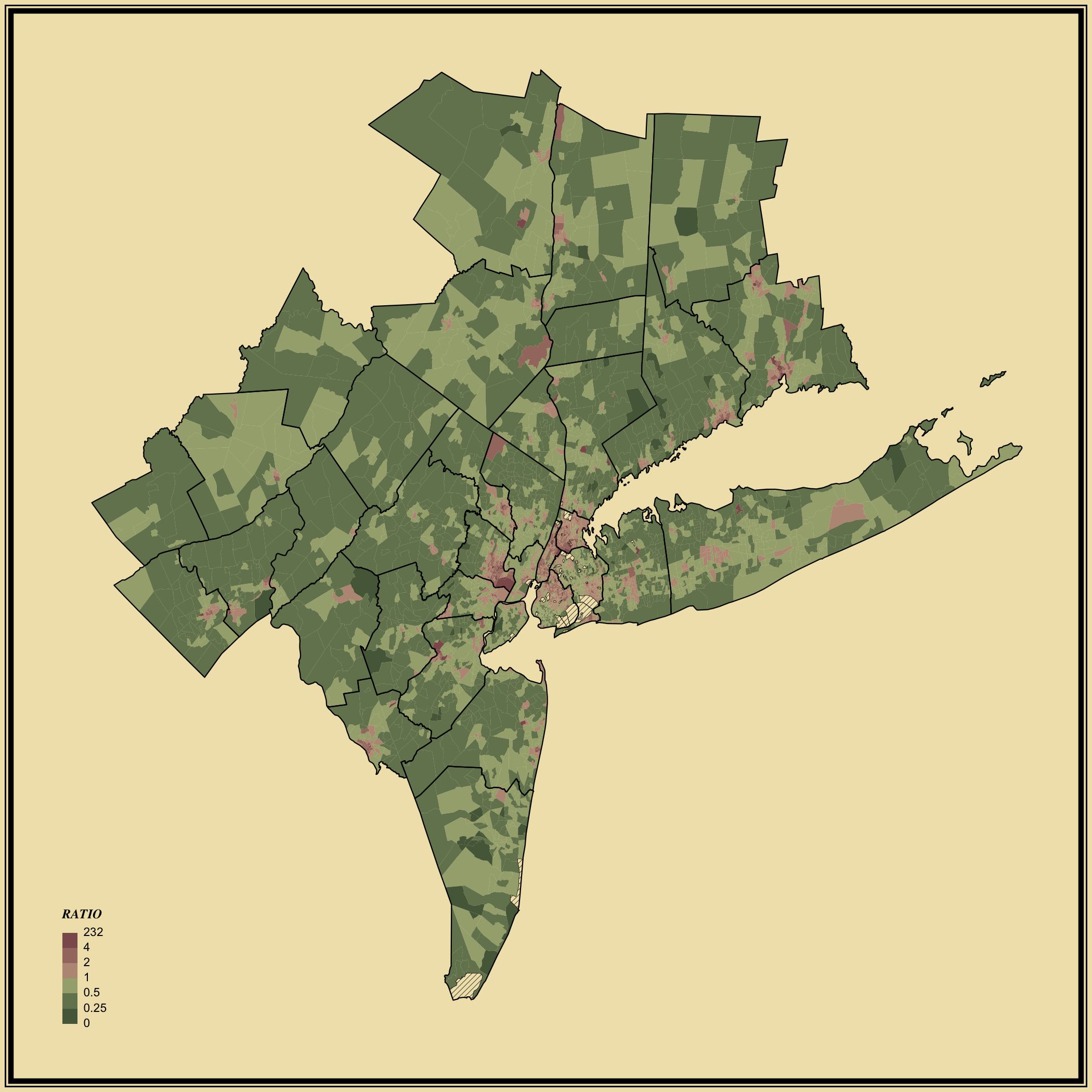
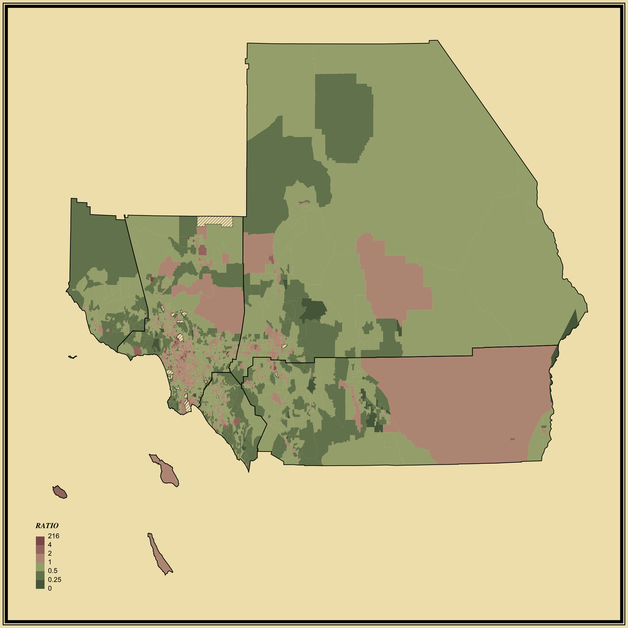
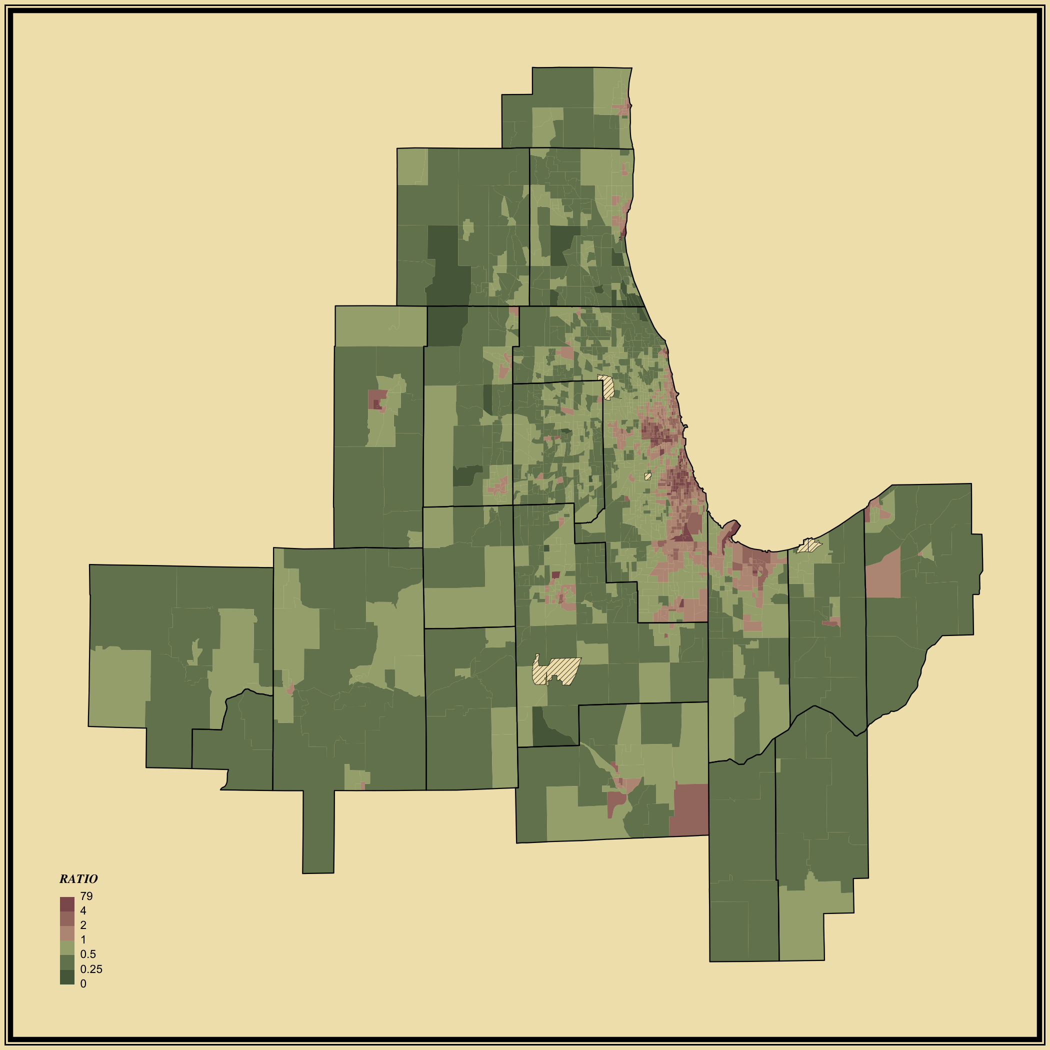


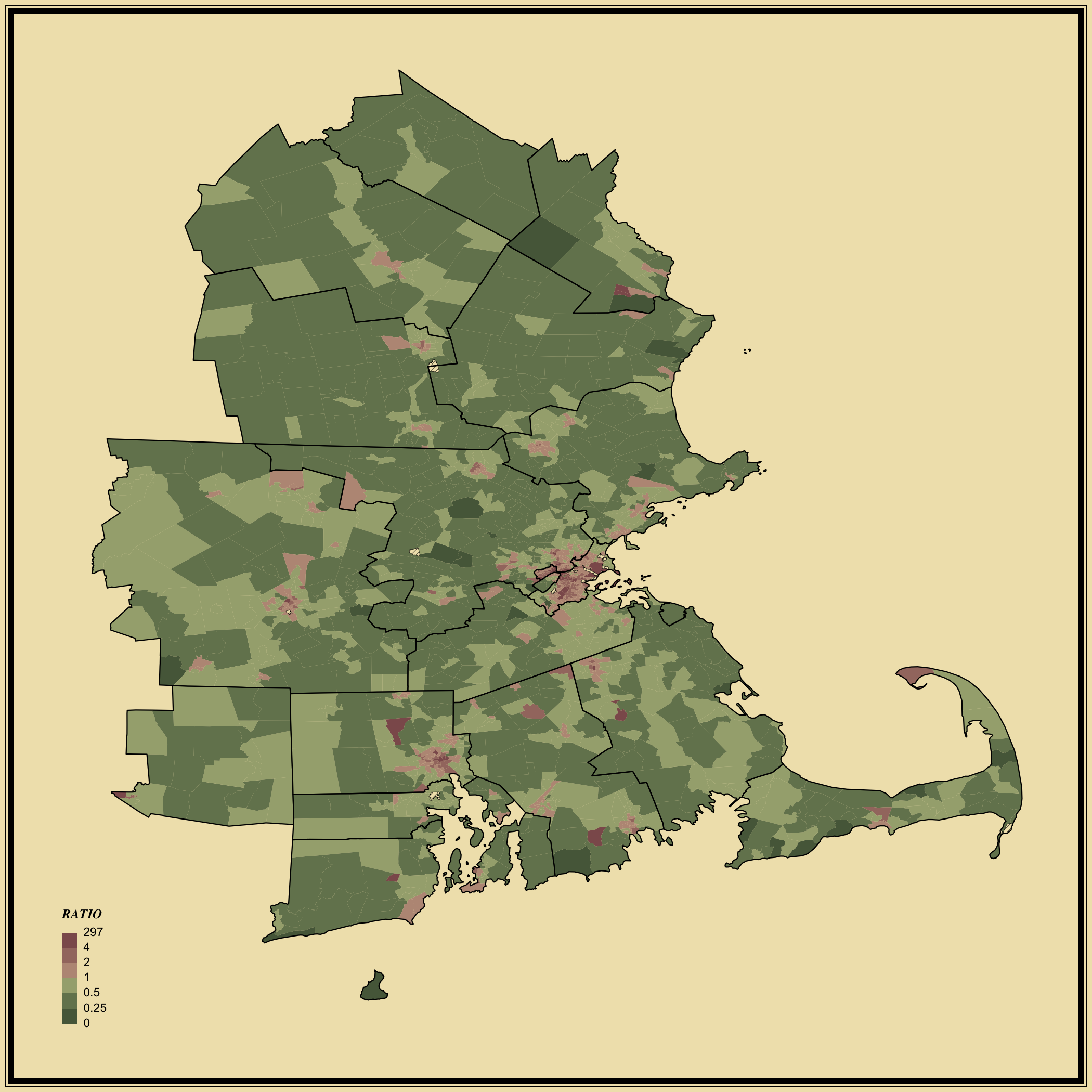
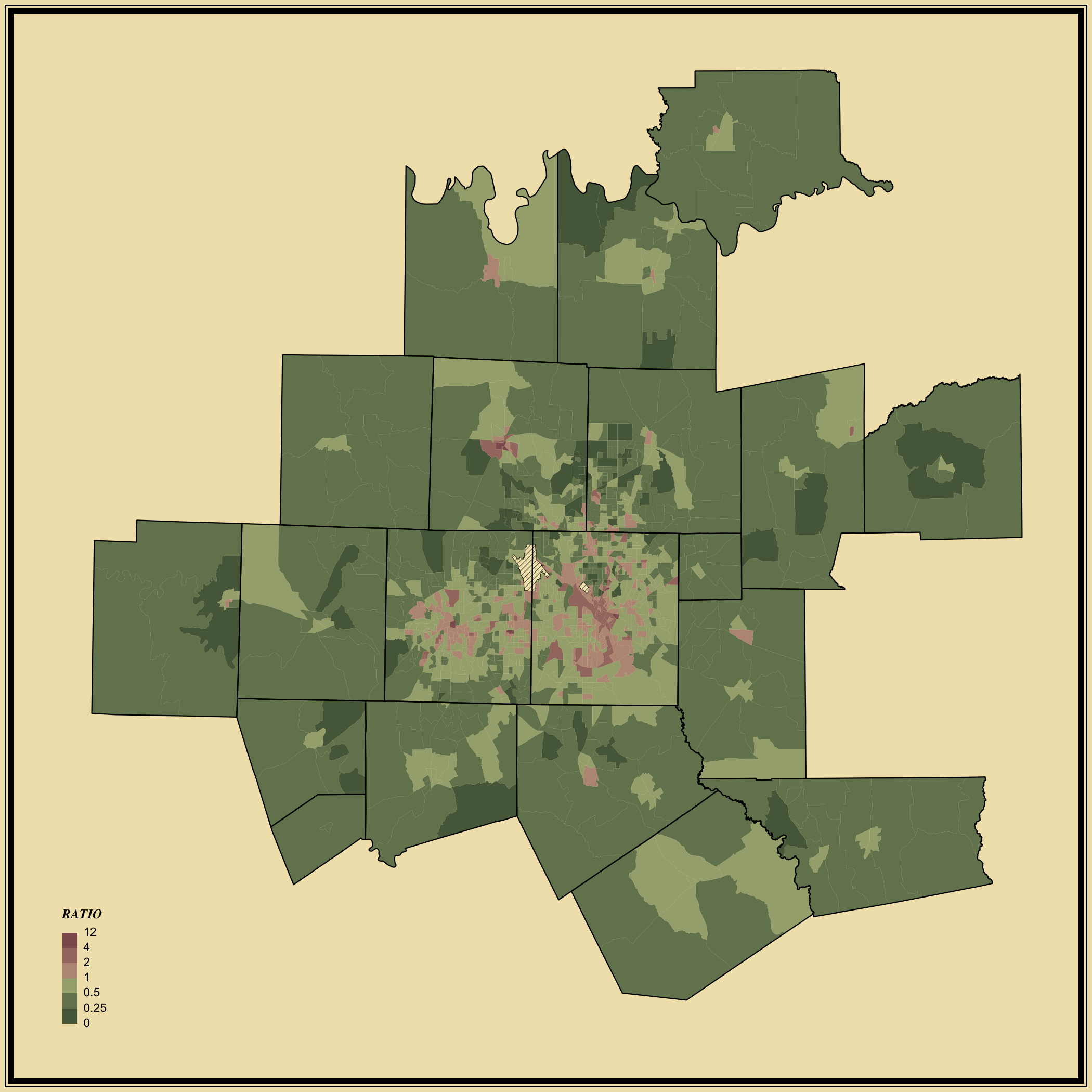
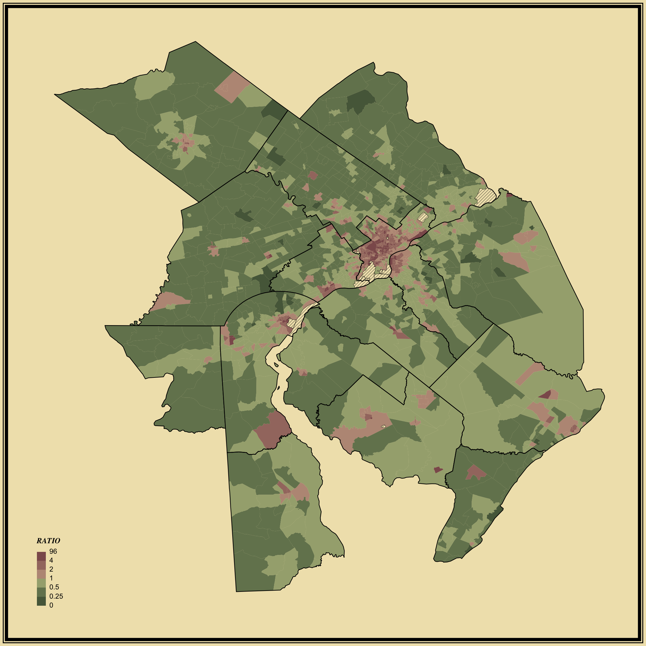
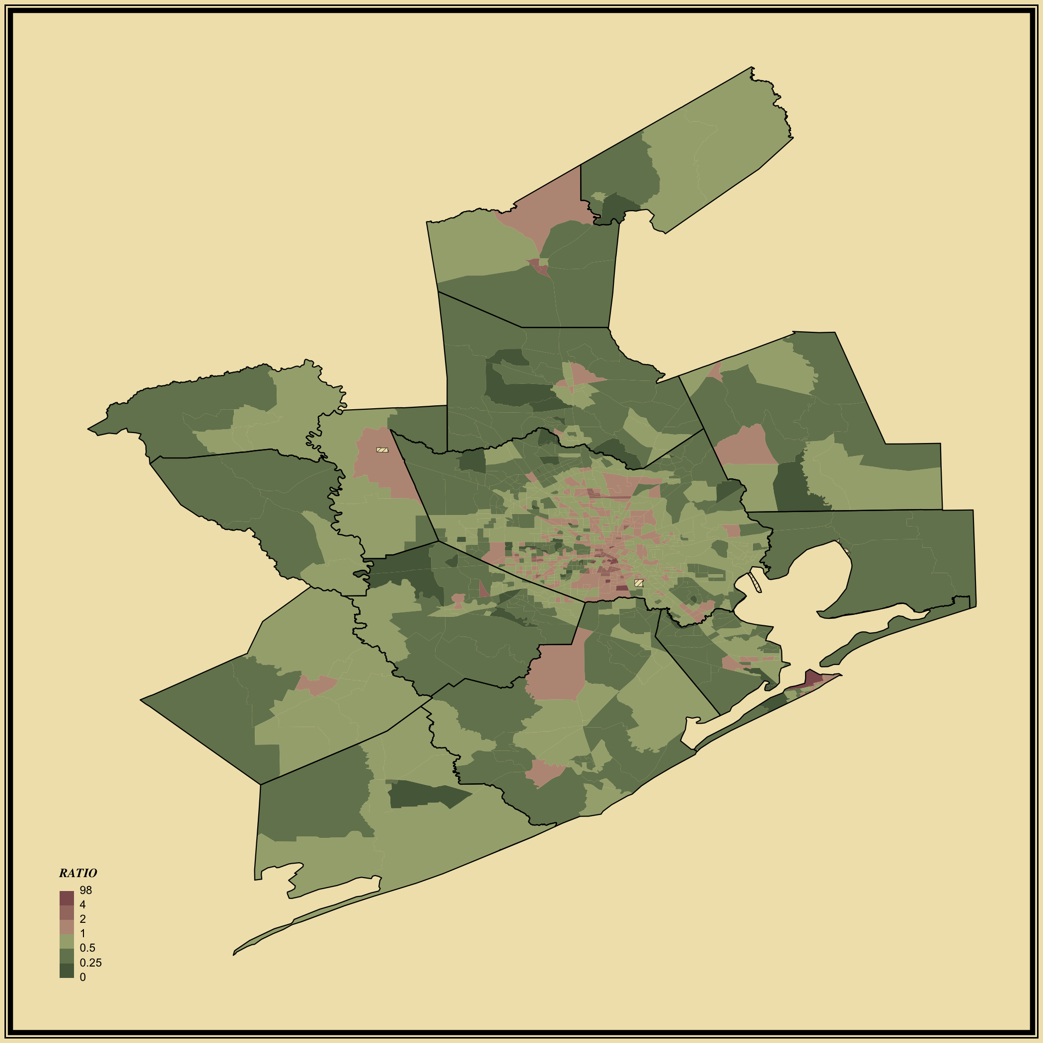
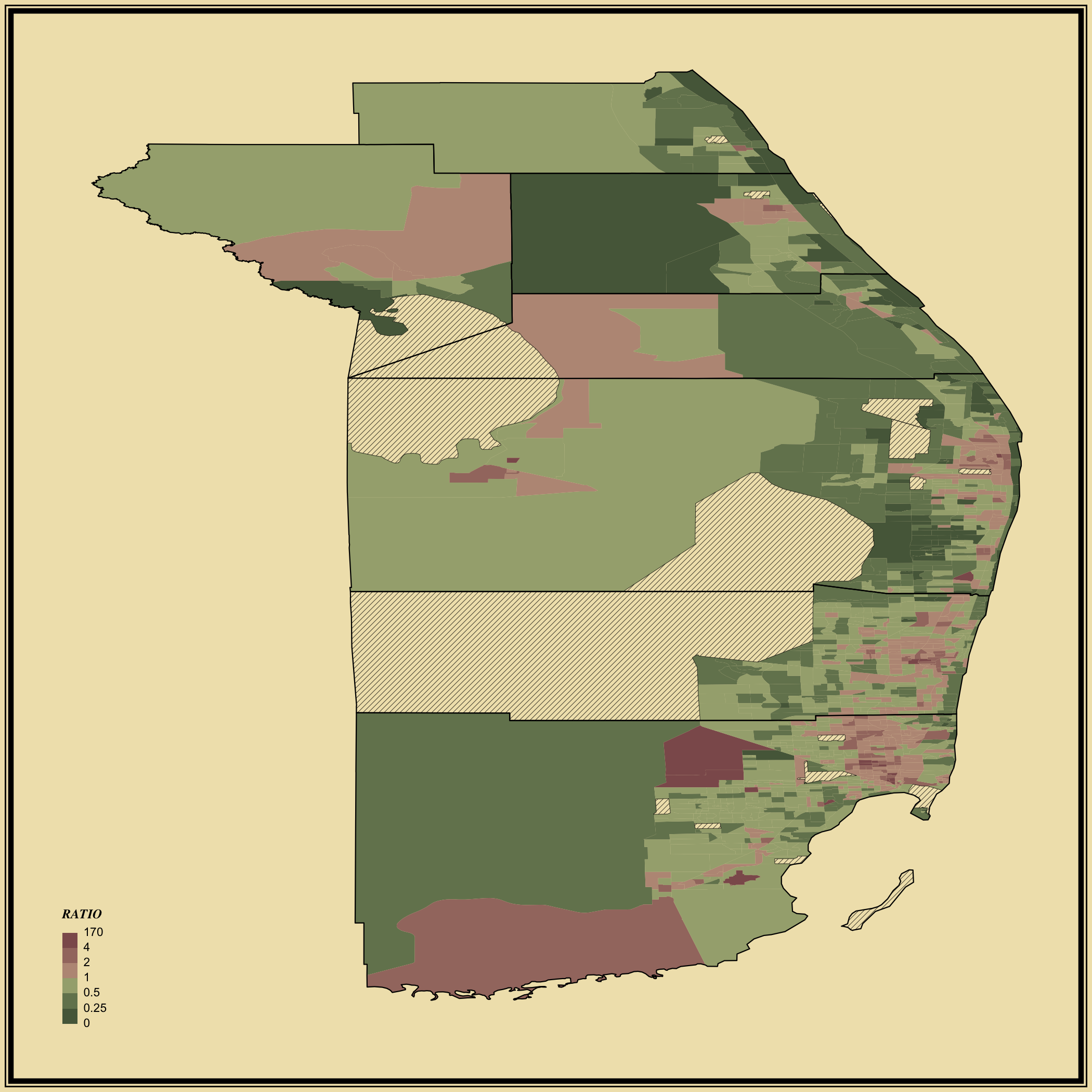
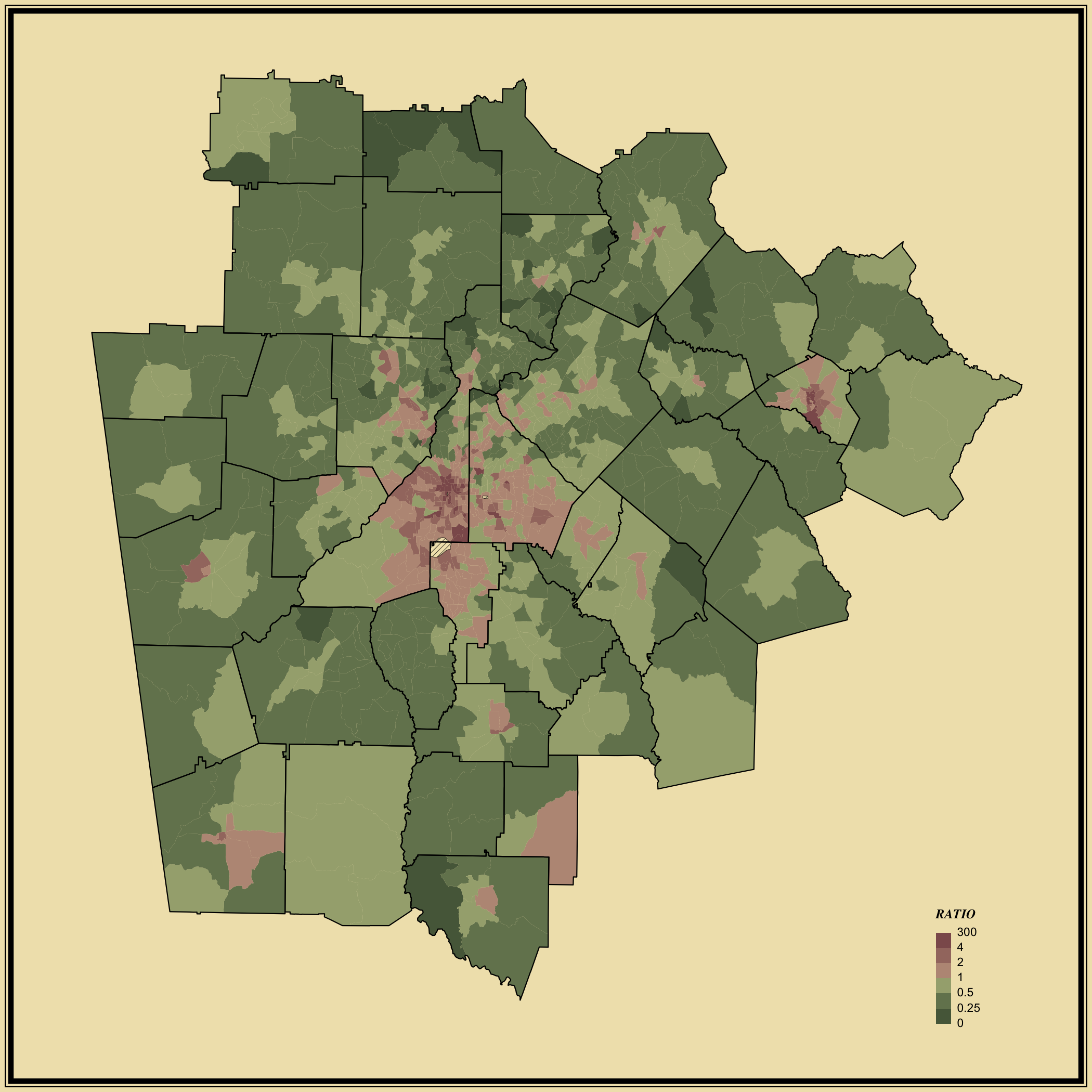
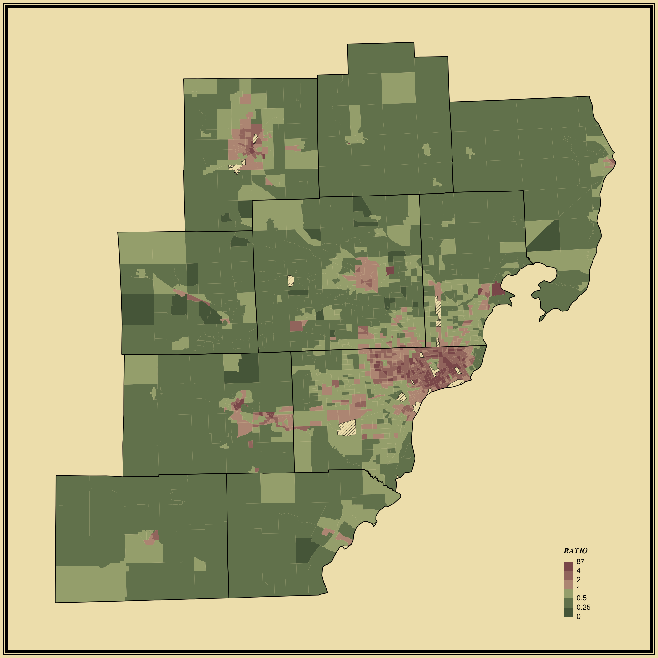
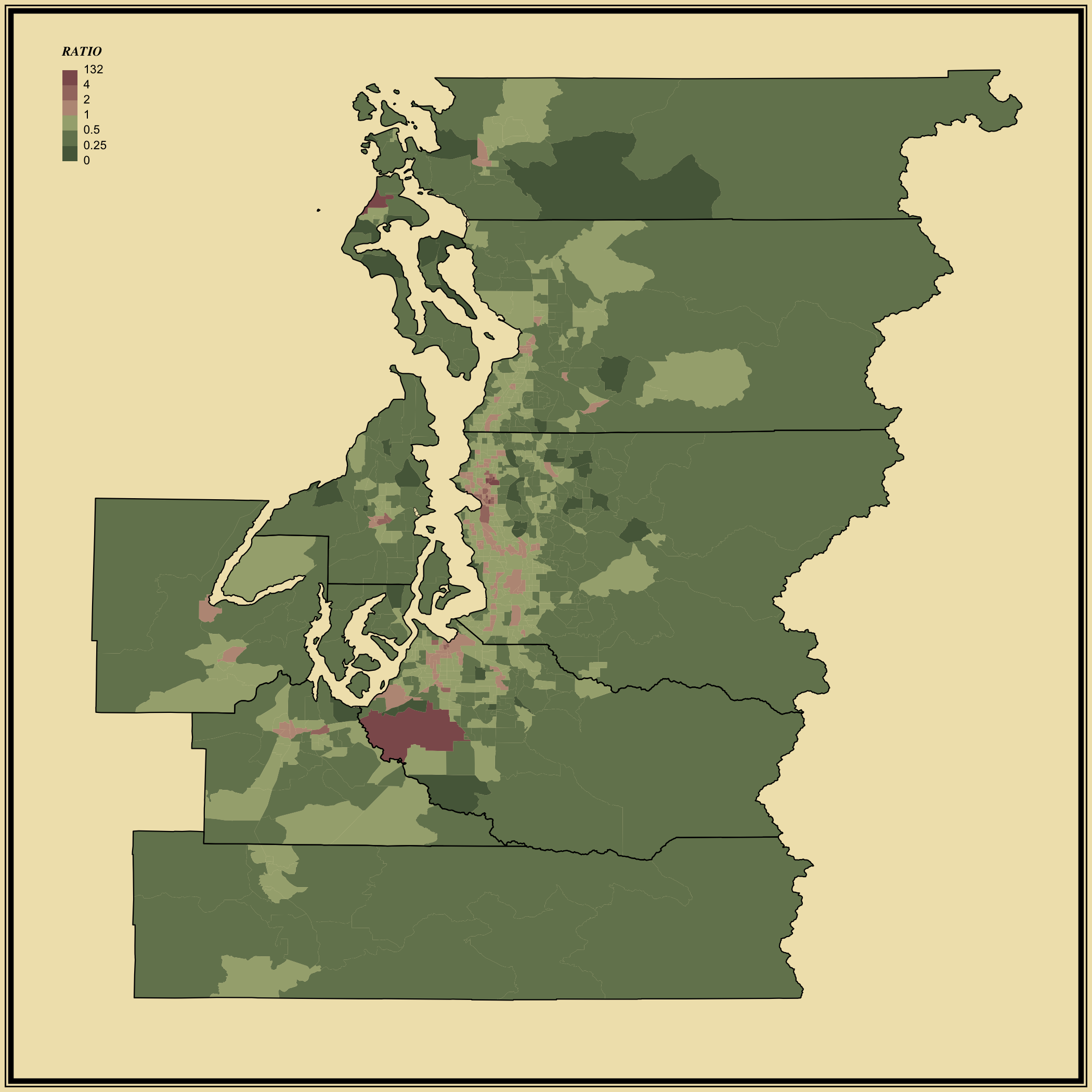
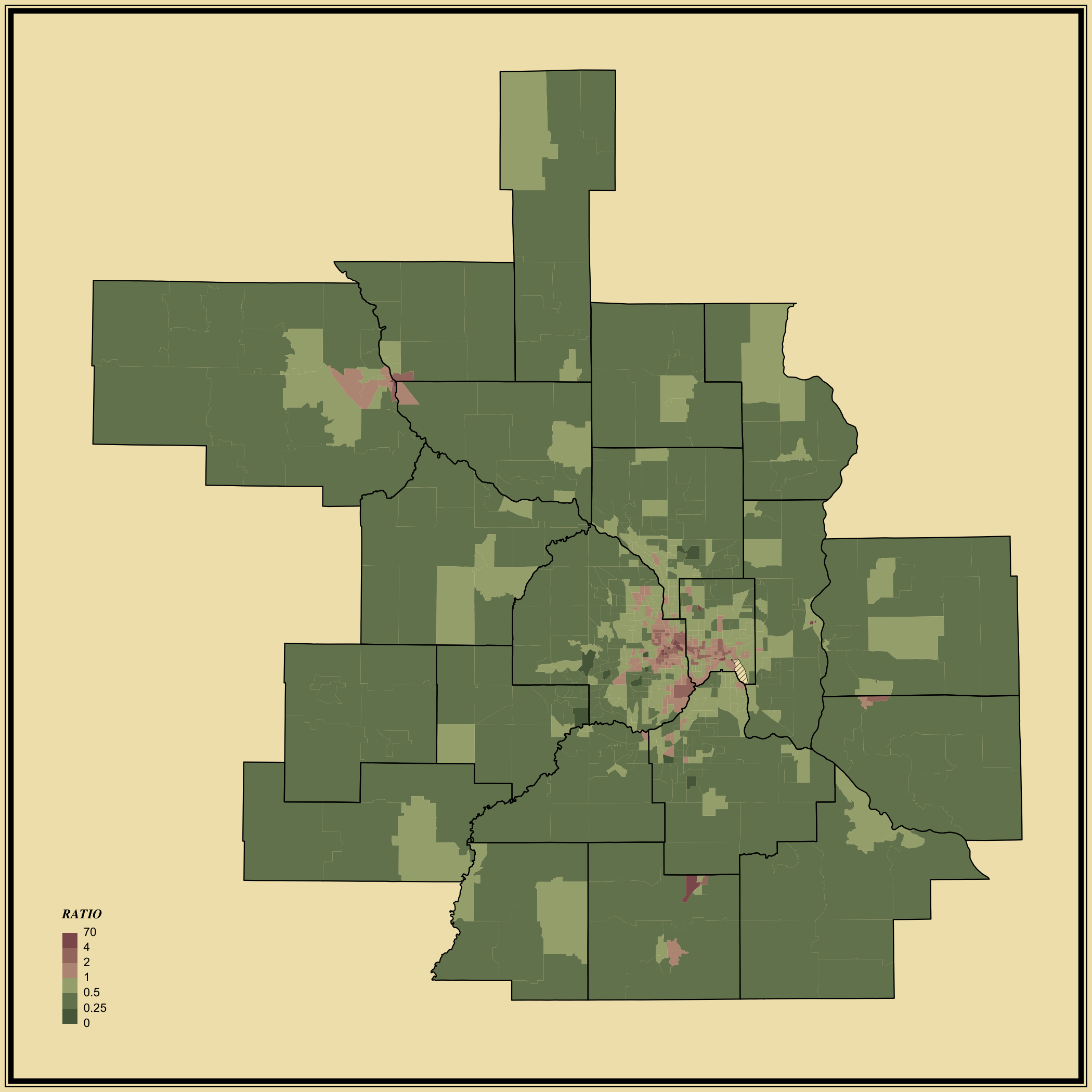
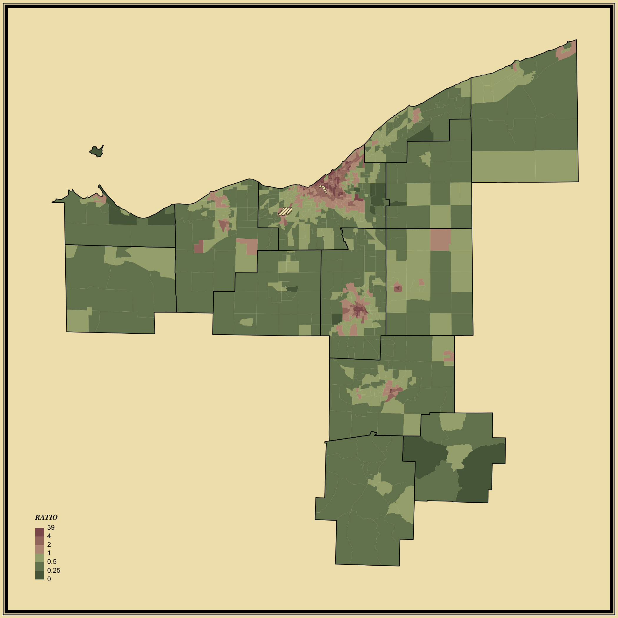
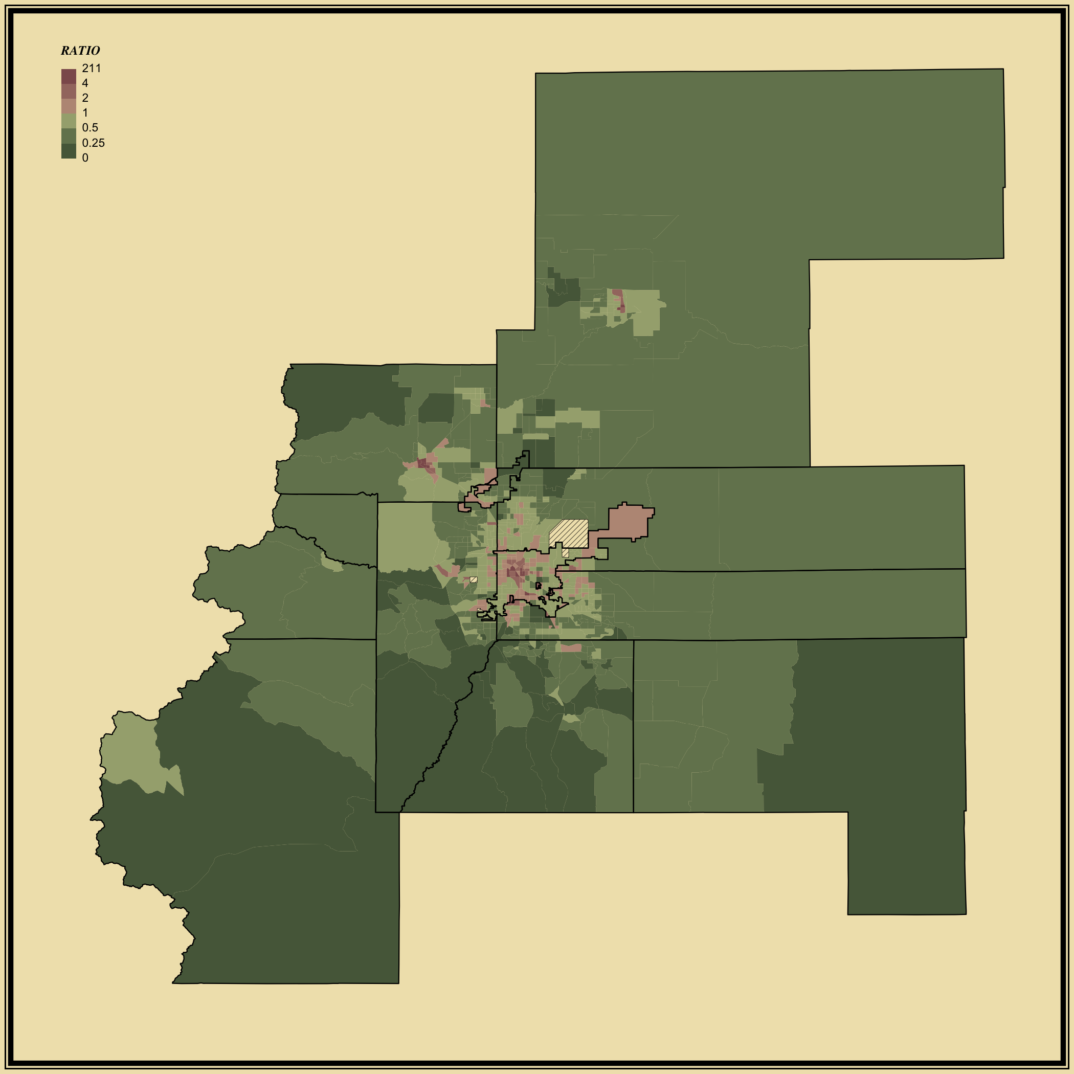


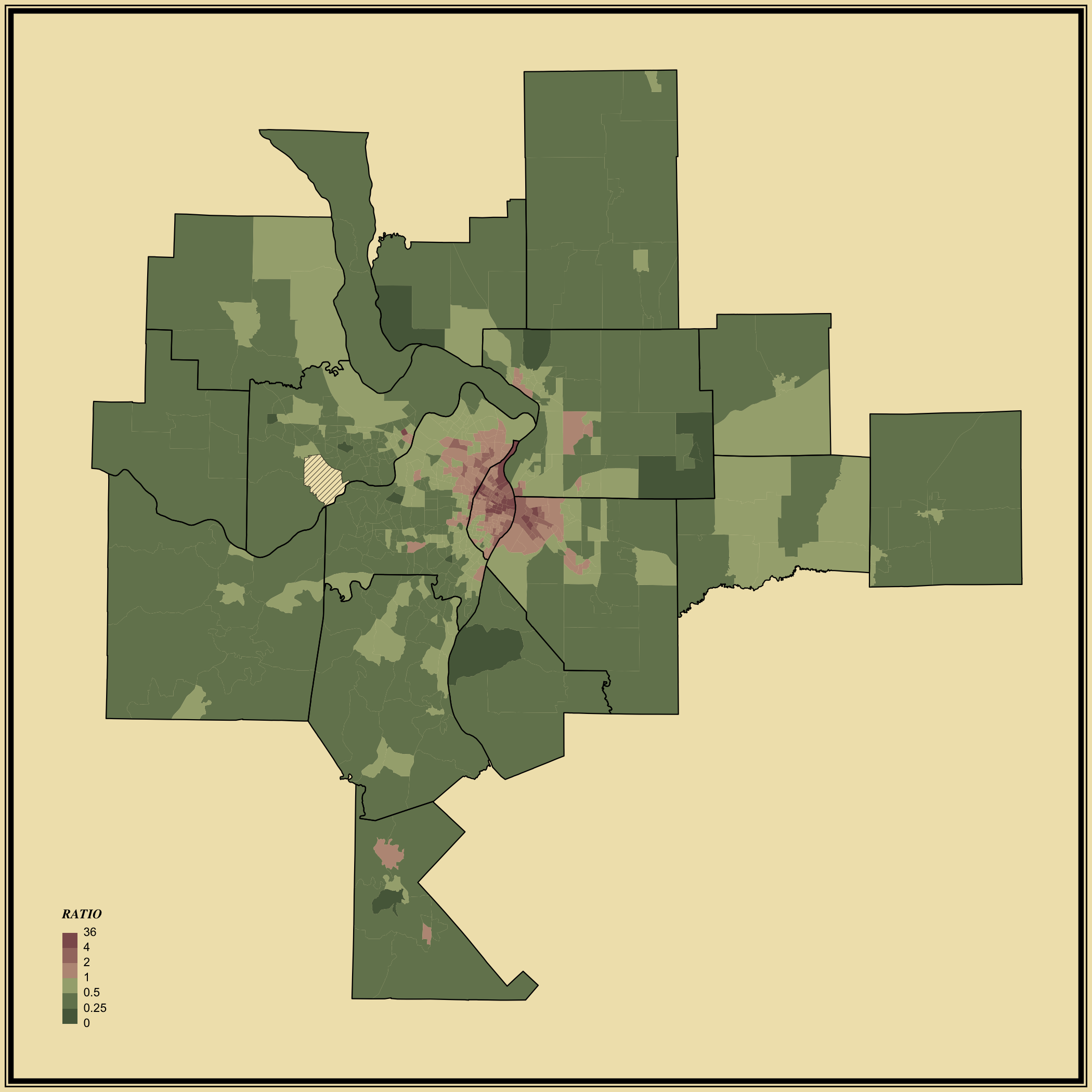
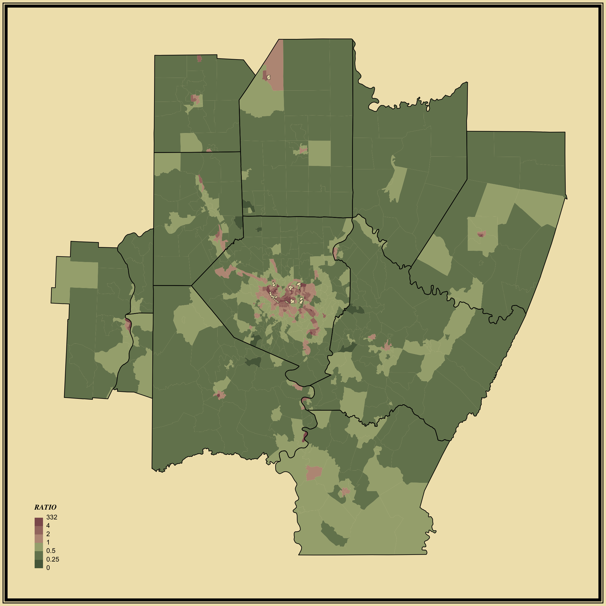
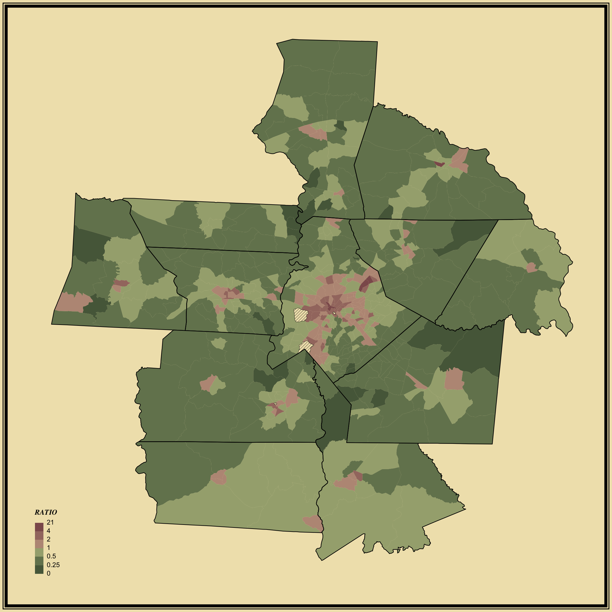
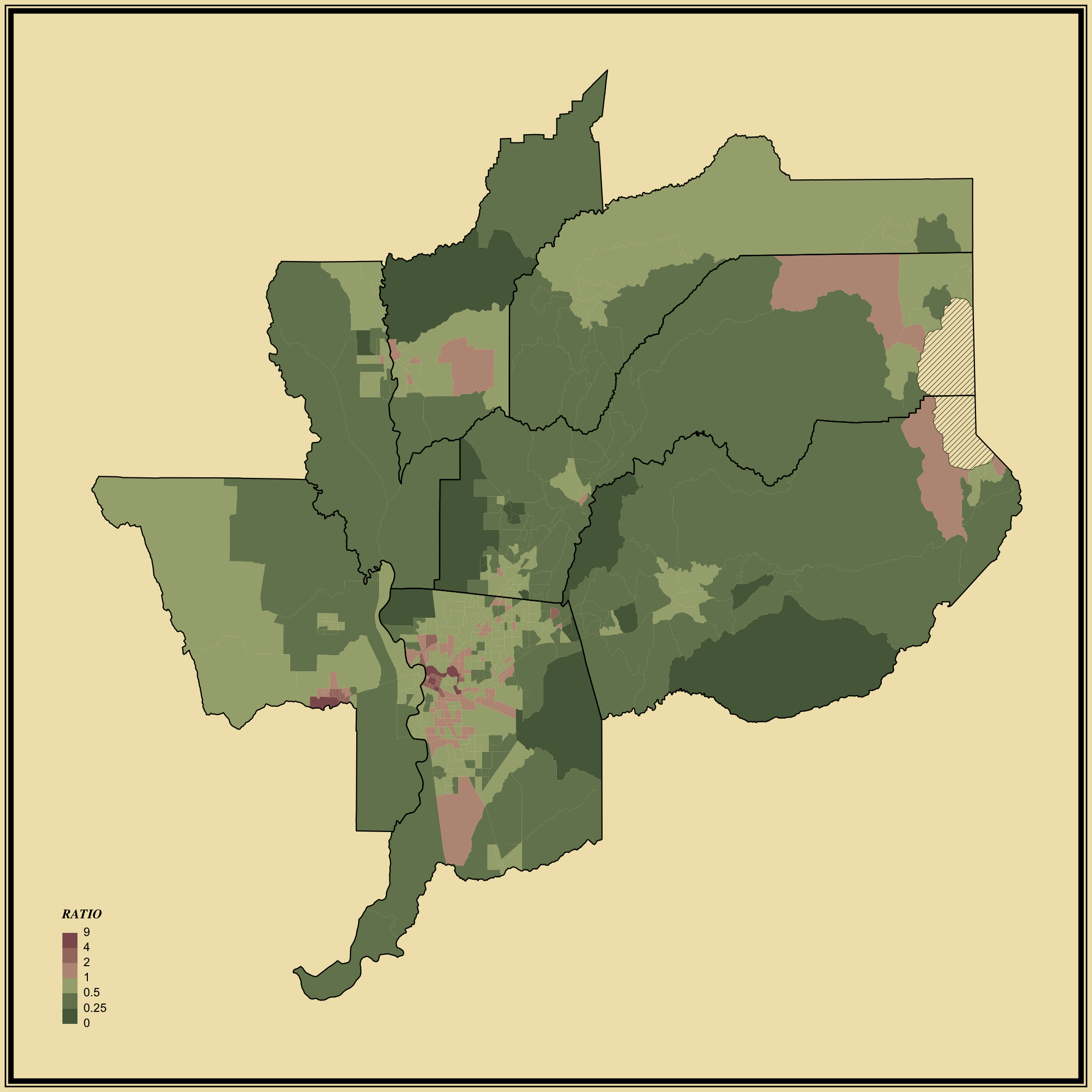

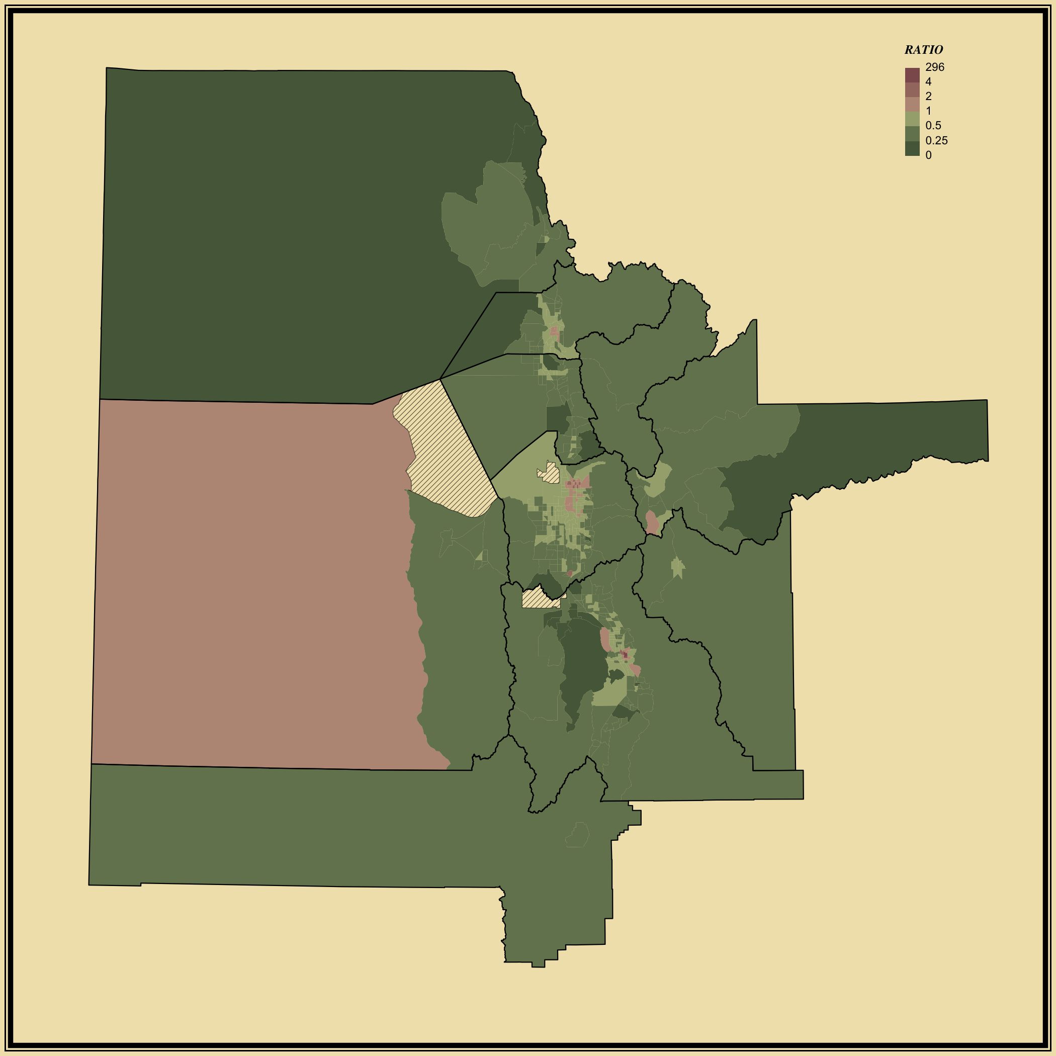
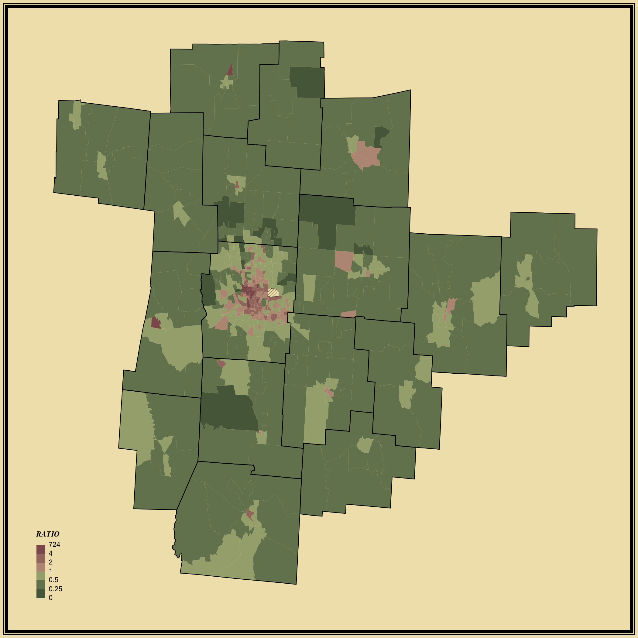


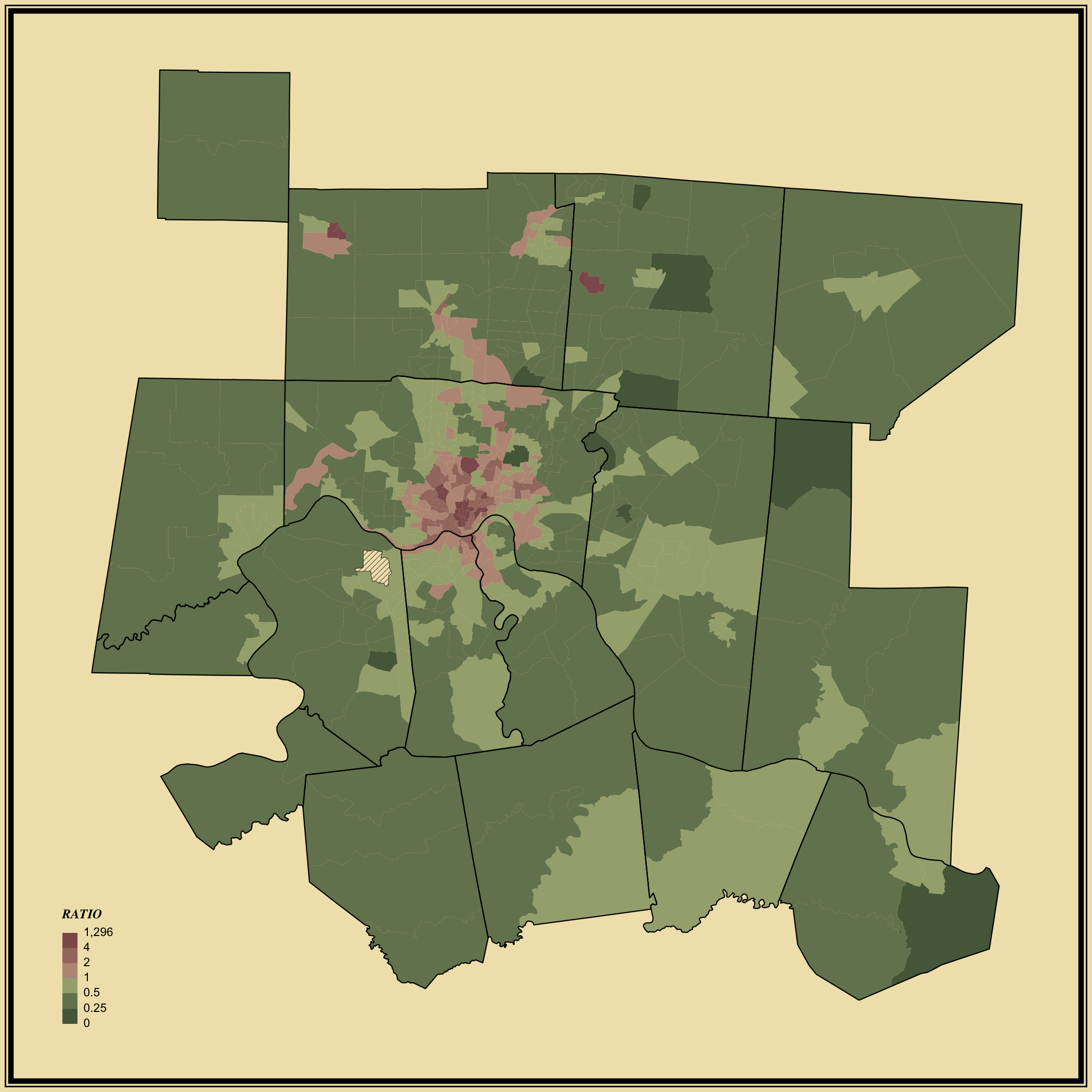
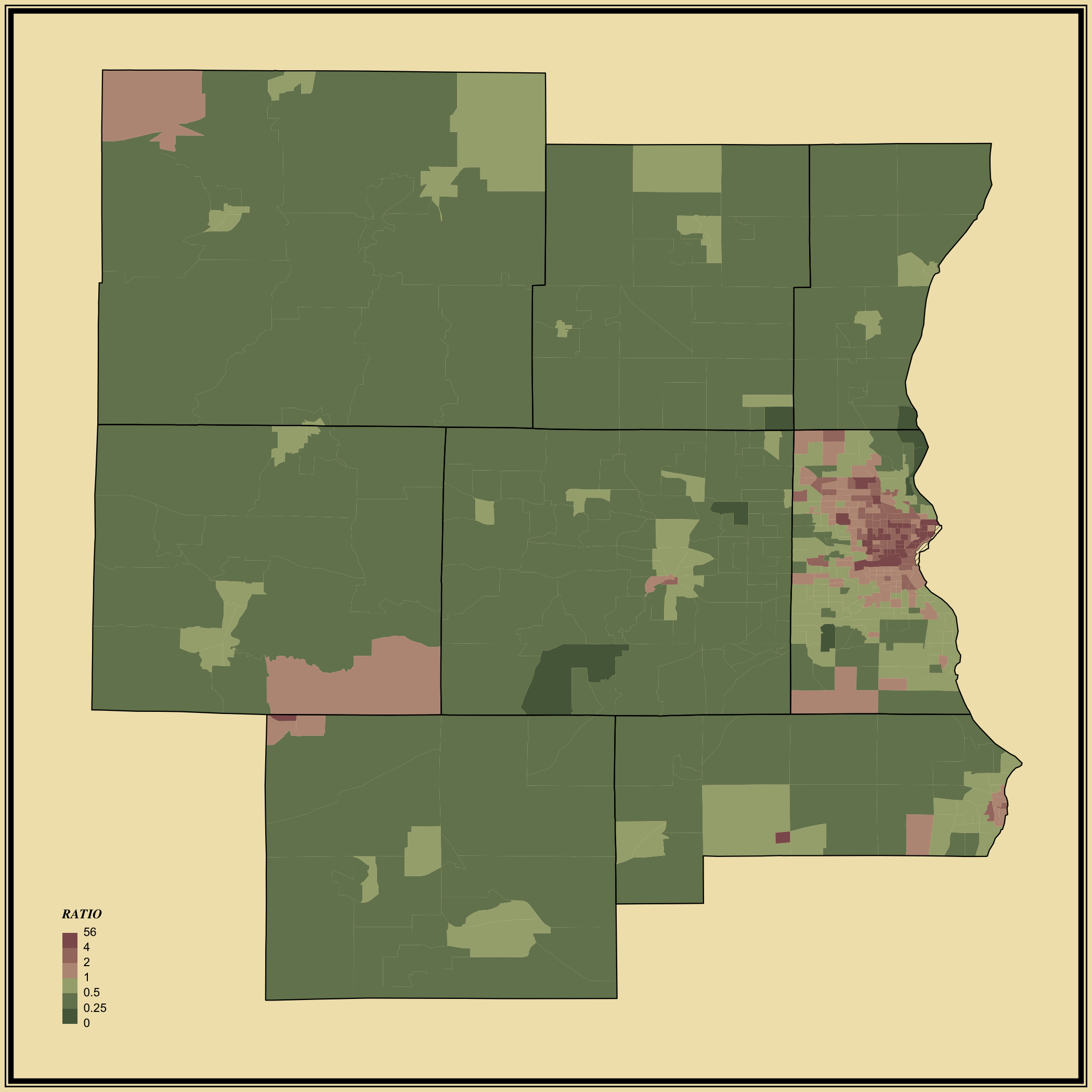
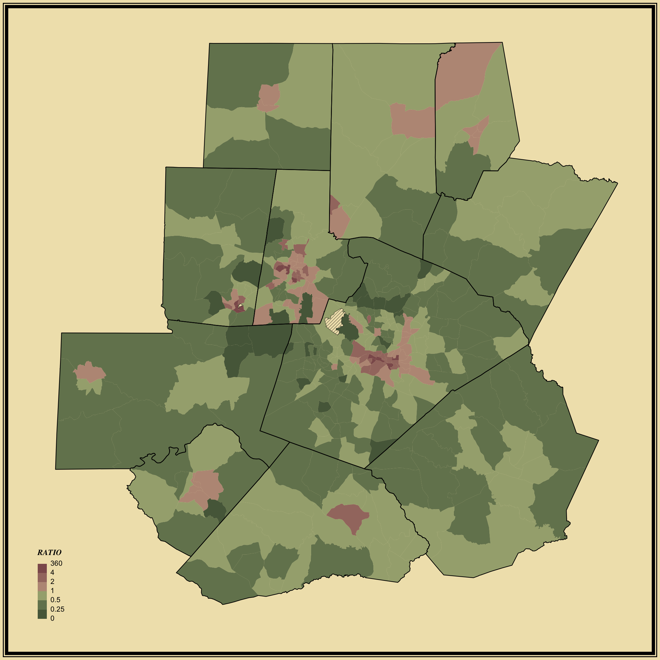
The above choropleth maps show the ratio of never married to married people, which is the former divided by the latter.
Therefore, higher values greater than 1 represent areas with more people who never married than those who were currently married at the time of the survey (purple). Values less than one and closer to zero represent areas with more people who married than those who never married (green).
In city centers, there are clearly more people who have never married, with ratios well above 1. Outside of city centers, the opposite is true.


